4 assessment drawings
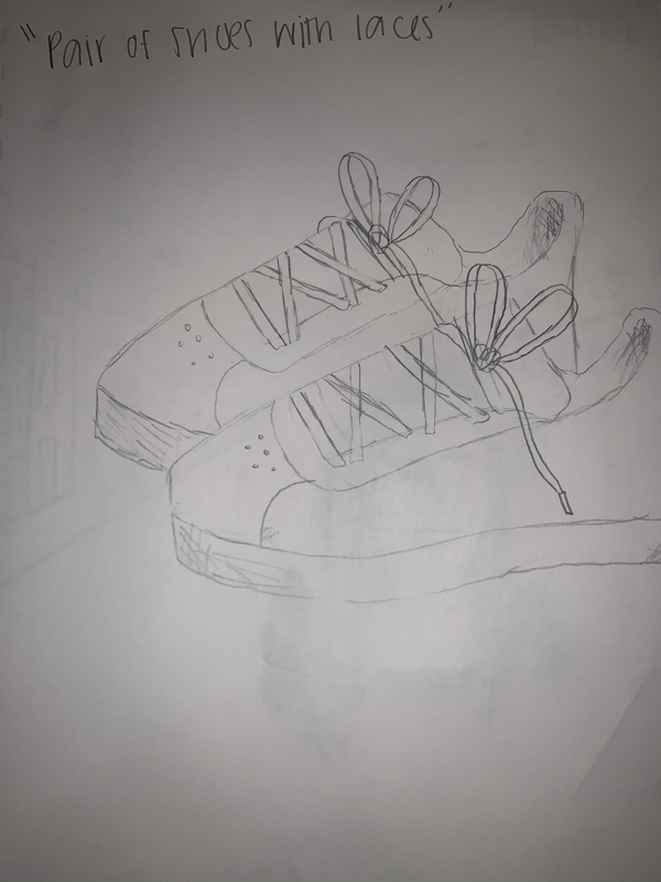
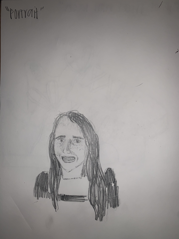
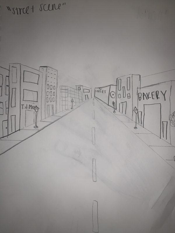
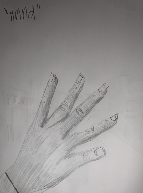
These are my 4 assessment drawings. I struggled a lot with the portrait and hand because I was not sure how to shade realistically.
Random object photo composition PractIce photos
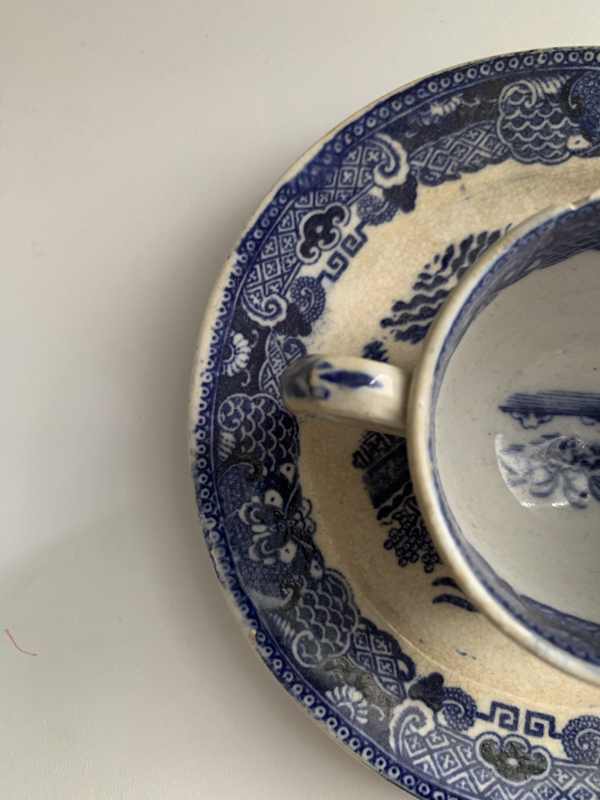
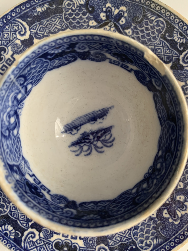
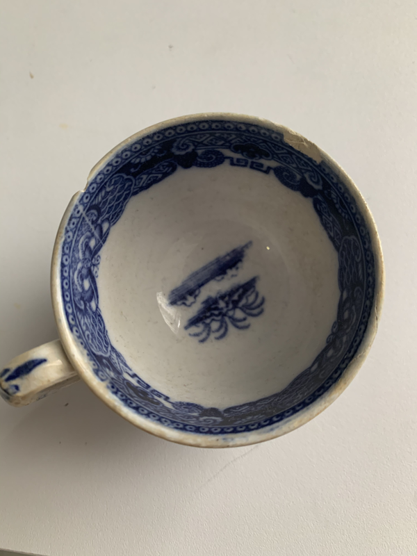
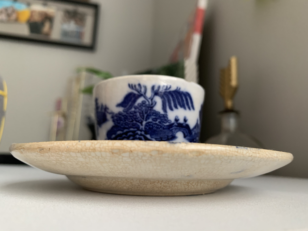
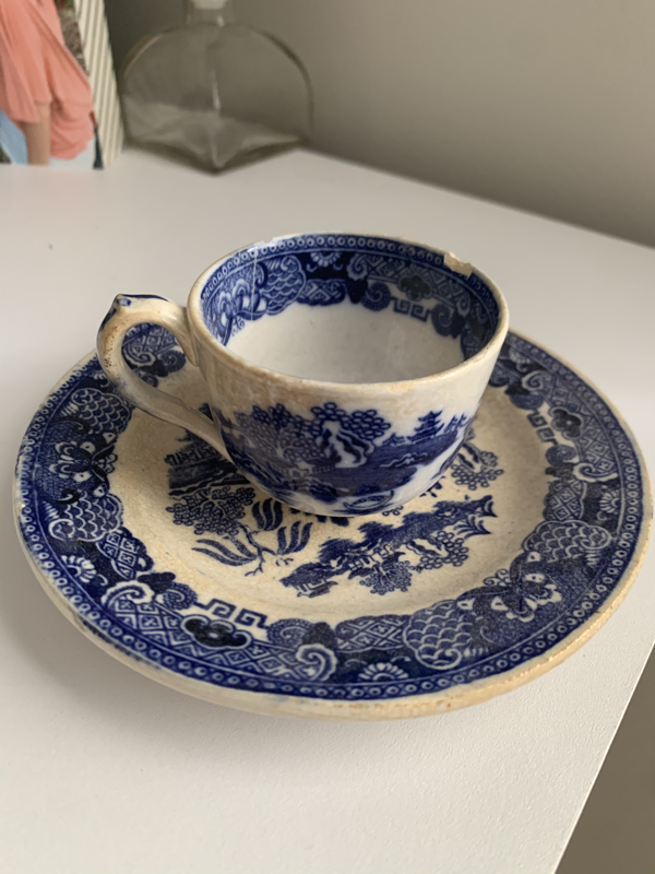
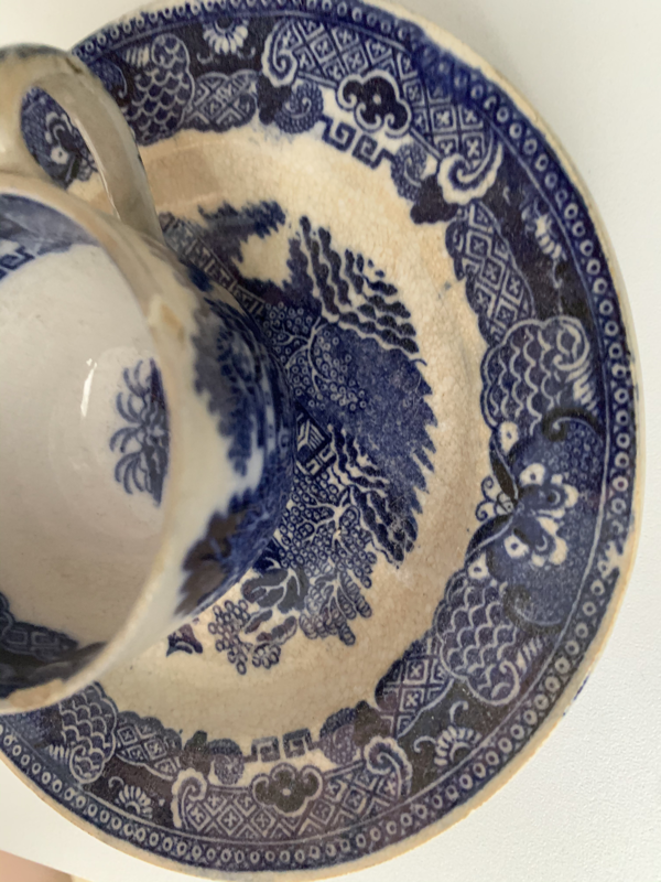
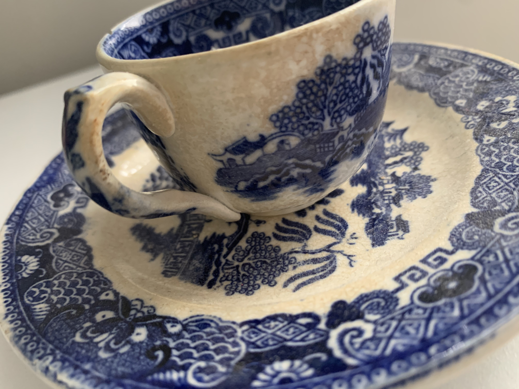
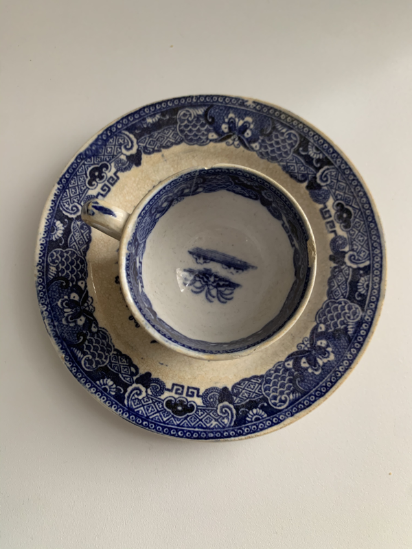
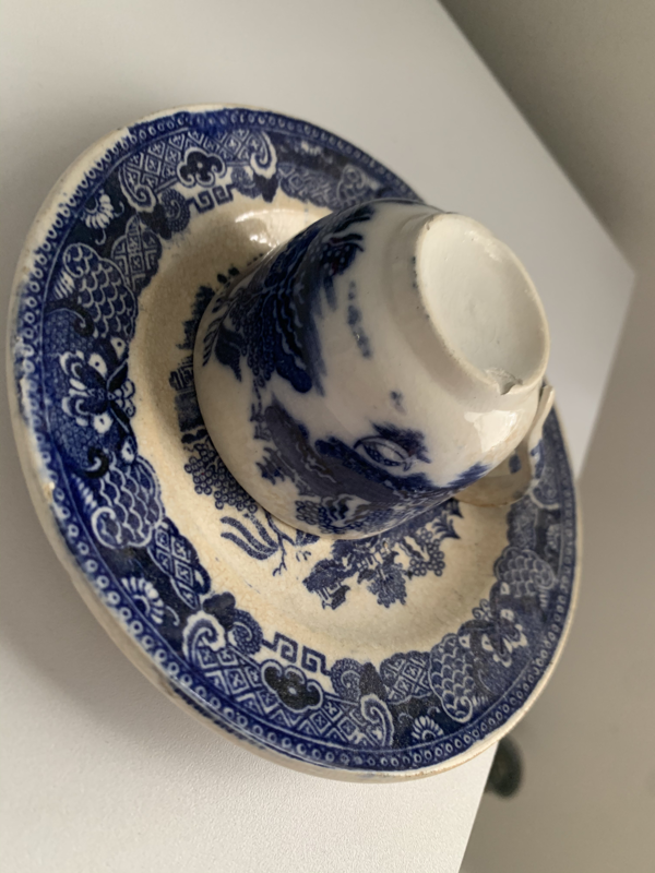
These are the 9 photos of my teacup. My favorite photo is the half photo of the teacup.
Value Chart and shaded forms
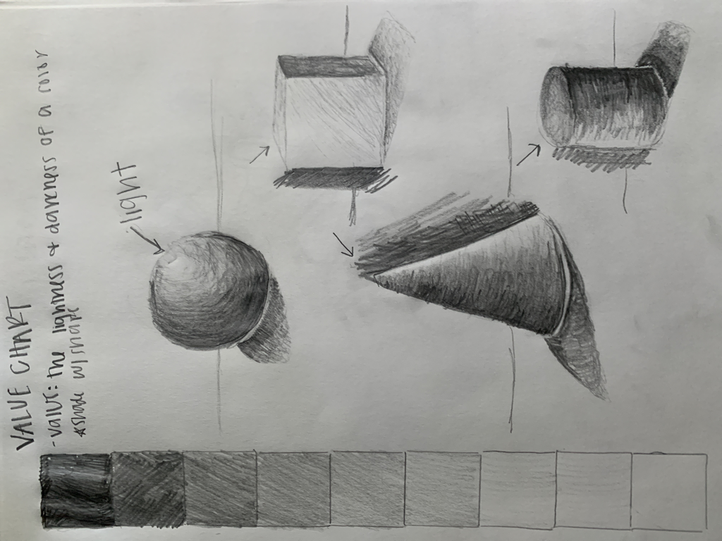
Here is my value chart and shaded forms. I used a graphite pencil and shaded from dark to lightest on the value chart and then shaded the shadows on my shaded forms.
Blind contour drawing
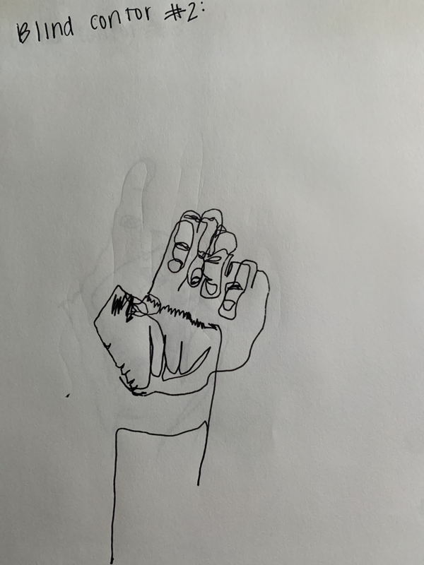
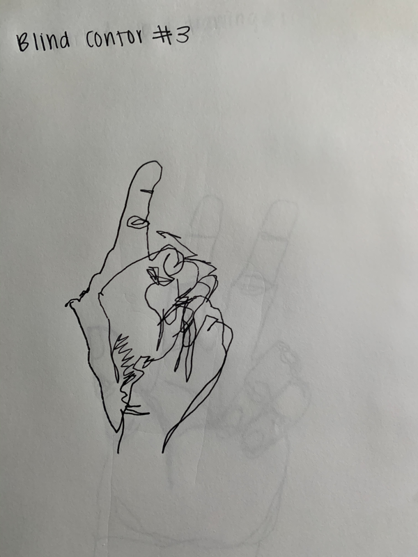
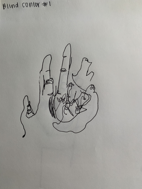
These are my 3 blind contour drawings. We used a ball point pen and looked at our hand and blindly drew our hand without taking our pen off the paper.
Modified contoUr drawing
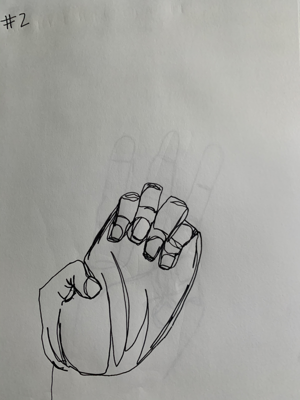
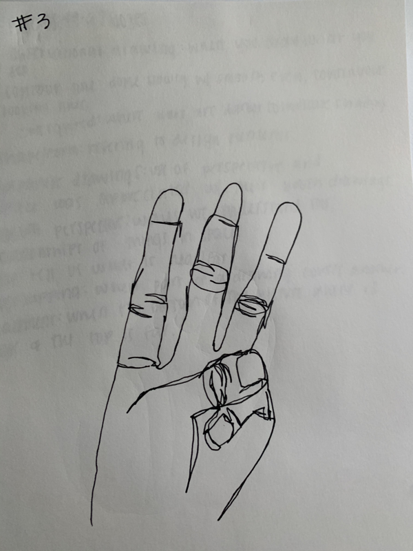
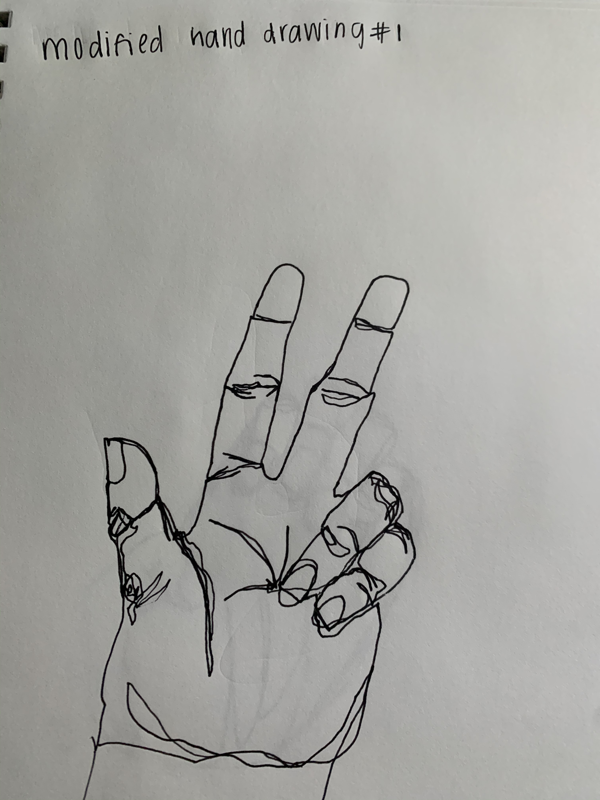
I drew 3 hand gestures using the modified contour method. I had 3 minutes to draw each position but could look at my paper. These are more accurate and detailed than my blind ones.
Contour shoe
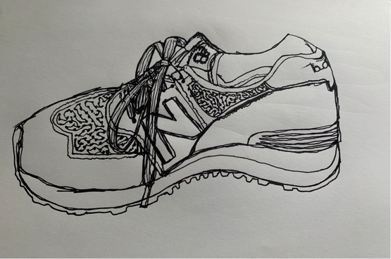
Using the contour drawing method I drew my New Balance shoe. I didn’t take my pen off the paper and I feel that it looks very accurate because of the shading.
Contour backpack
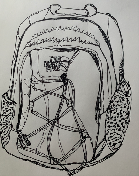
This is my North Face backpack drawing using the modified contour method. I feel that it is accurate because the pen is darker in certain places to show depth and direction.
Virtual learning 3 photo series
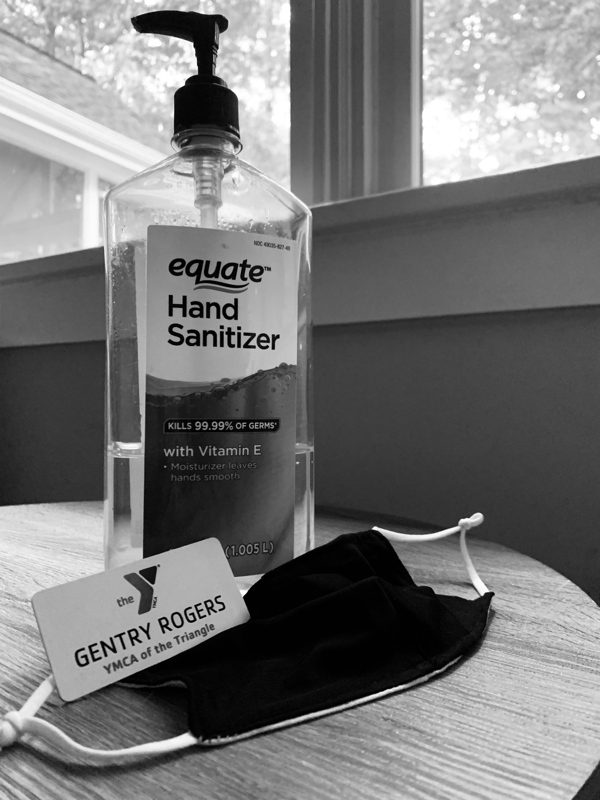
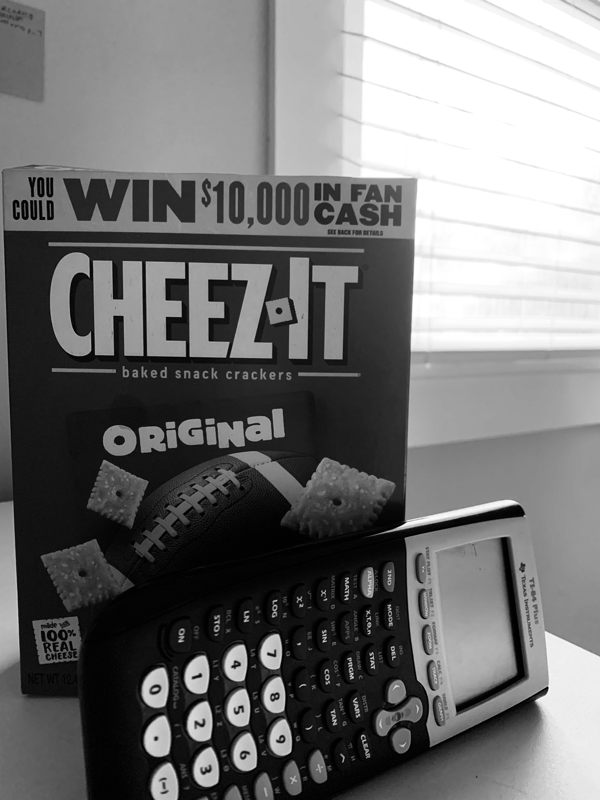
(Click on photos to see entire thing). These three photos describe the beginning of the school year, virtual learning edition. This type of artwork is taking compositional photos of a series or objects to tell one story. My photographs tell the story of my experience with online learning. Out of all the photos, only the hands in the third photo have some color. This is because virtual learning is not exciting, there isn’t much life to it. It’s lonely but it’s what we have to do. That’s why all other objects are in black and white but the hands of the person (the only life left) is still colored. There is a variety of different objects in my piece. This is because there are many untold aspects of virtual learning that are needed to tell the whole story. For example, my first photo has a variety of objects in it because each of them connect to tell the story of my job, I work at the YMCA and help kids with their online learning. This variety shows that virtual learning isn’t all at home, and shows many kids have to wear masks and wash their hands consistently because they are doing this in a public setting. The idea behind my piece is that I wanted to show three different aspects of my experience with online learning. First, my job. Second, what is keeping me excited (food). And third, boringness. I was inspired by objects in my home, my snacking, the kids at the YMCA, and the darkness of working alone all day. My piece shows this in each of the photos because each subject tells each part of the story. Black and white only photos describe the boringness and sadness of online learning. I find my piece successful because each photograph tells it’s own story. They all tell different parts of my online learning story and the beginning of the school year to create one big idea. From this assignment, I learned that taking photos with meaning, while using the compositional rules creates a good photography series.
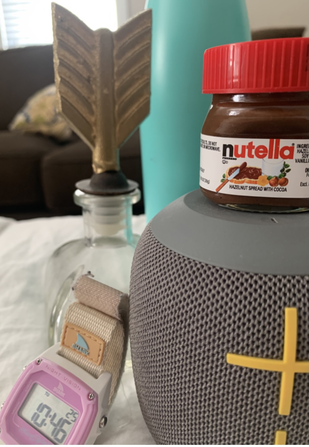
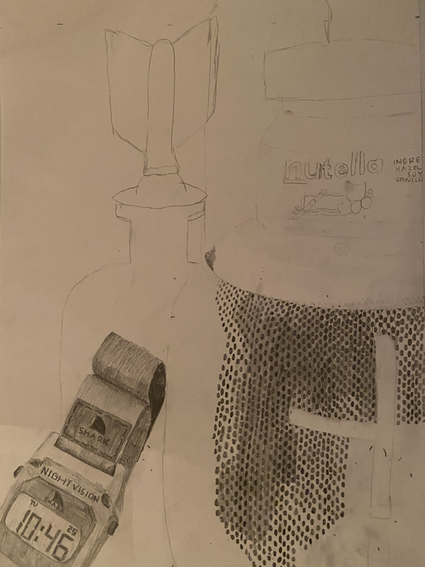
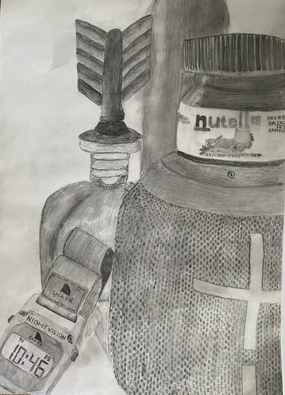
Still life
This is the Still Life I created.
These are the 5 photos that I took of my still life through the viewfinder.
These are the 5 sketches of my 5 photos that I created.
This is the final photo I chose.
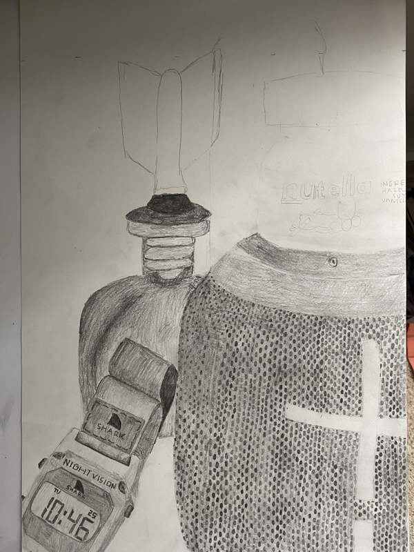
These are my two in progress photos. These were taken throughout the project completion.
1. Describe the craftsmanship of your drawing. (Is it clear, clean edges, blended well, smudges, defined space, etc.)
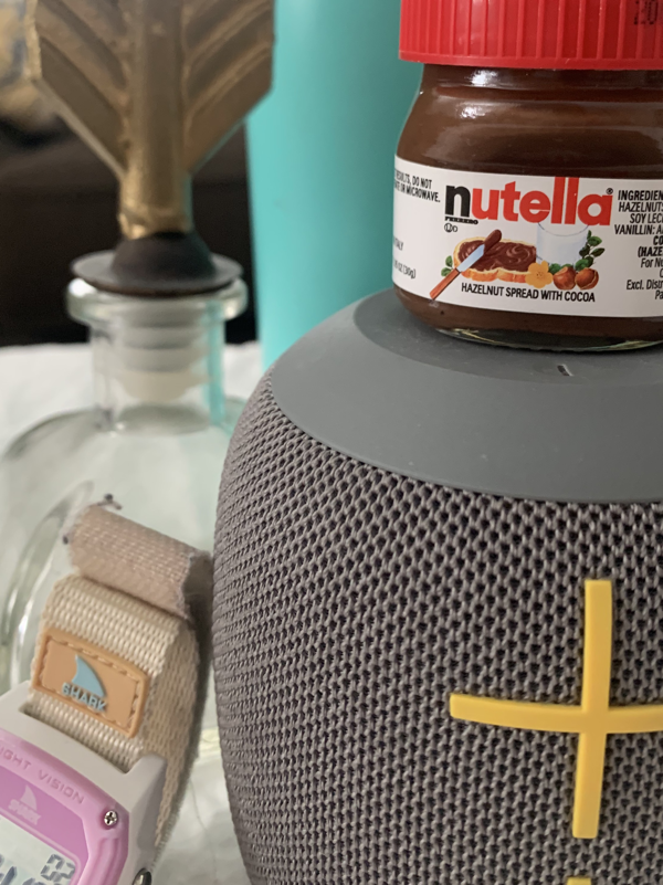
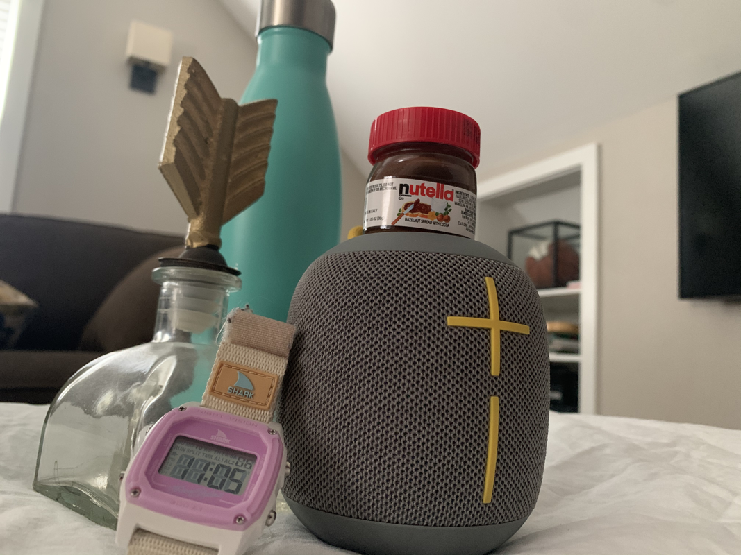
My drawing has clean edges. You can clearly see where each object is. I also think that it is blended fairly well, I possibly could have blended the speaker better but overall I feel that it is blended well. There are a few smudges, but most I was able to erase and the space is defined because the objects create a visually appealing composition.
2. Are your values and shadows realistic? How many values did you include? How and why are values important?
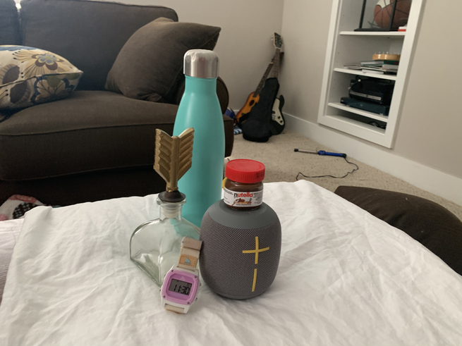
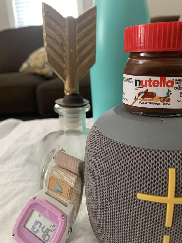
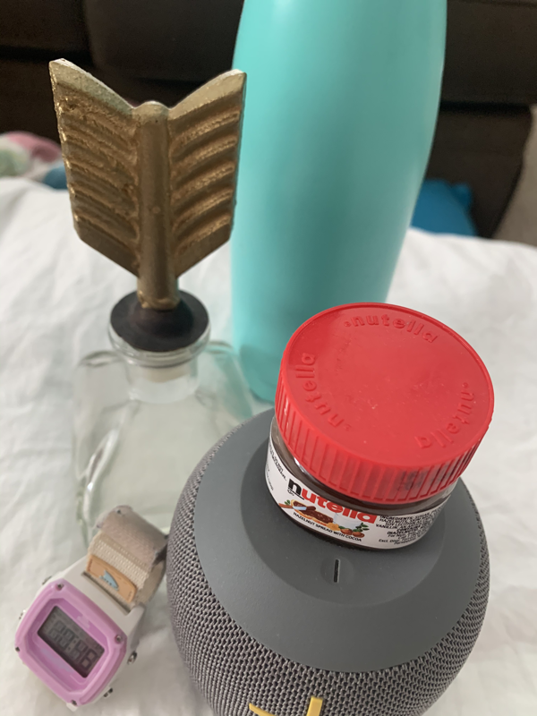
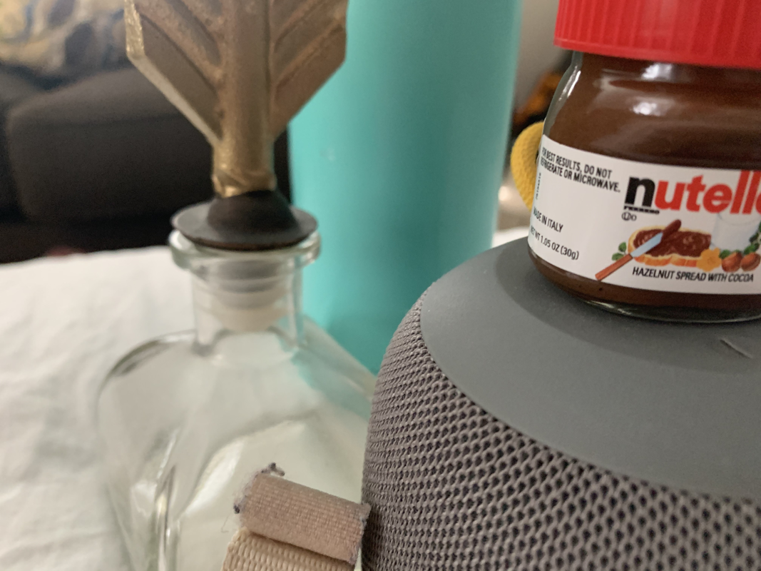
Yes by shadows and values are realistic, My original photo did not have much shadow so I had to dramatize the shadows. There is value on the watch where there is shadowing, on the nutella jar and the water bottle where the light hits it. There is also value in the jar feather top where there is highlights and shadows.
3. Is there a clear source of lighting?
Yes, there is a clear source of lighting, which comes from the top right corner. This is evident in the watches shadow, The nutella jars' highlight and the water bottle's highlight.
4. How important were the compositional sketches? Explain.
The compositional sketches were important because it allowed me to find the best photo angle and composition and find the best placement of objects that will allow easy eye flow.
5. How is your final drawing successful?
My final drawing is successful because each object shows depth and dimension while also looking realistic. All objects are also drawn to scale. The watch is realistic and shows the shadows where there is no light and the exact details of the original photo. The speaker also had all the small hole details that the original photo had which made it more realistic. To make it more successful I could have created darker and larger dots that flowed better. The nutella drawing is successful because It shows exact highlights as well as the darkness and lightness of the actual nutella jar. The jar with the feather top is successful because of its dimension. You can tell that it is behind each of the other objects and what is darker and what is lighter. The water bottle is successful because it shows the shadows on the side and the highlights on the other side where the light hits it. Each object is shaded accordingly to where it is placed behind other objects which successfully shows the dimension.
6. Are the proportions, structure and perspective of the subject correct?
The proportions are almost exact. If you line both photos next to each other each object is at the same angle and same size as the original photo. The structure is correct, especially on the watch. The perspective is also correct, it is drawn from the same angle and point of view that the original photo was taken.
7. Does the placement & grouping of objects create a pleasing arrangement (composition)?
There is a pleasing composition, the objects are nicely stacked and they aren't in the center or too far off the page. There also isn't much negative space but just enough to create a well spaced composition.
8. Is there a center of interest and is it well located?
The center of interest is the large speaker. It is located on the right side and creates the spacing into thirds. This means that it is well located and pleasing to the eye.
9. How well did you manage your time and resources throughout the process of creating this drawing? Do you see where you could improve in this area?
I had to spend alot of my time on my speaker and watch. This is where the most detail was needed and the most space was taken up by the speaker. I wish I had taken more time to create the speaker, or thought of a better method. Each of the little dots took very long and I wonder if there was a better method to do those than the one I chose.
10. What challenges did you encounter during this project and how did you overcome them?
My biggest challenge was creating the holes in the speaker. I wasn't sure how to make each of them exact or make them perfectly circular around the speaker. I tried to do a pattern first and fill in the holes, but then that did not look good. So I decided to draw each individual hole and then fill in the space around the holes with shading. I also found that the smudging and getting the perfect shade was difficult, but after trial and error I think overall the highlights and shadows are correct.
11. What have you learned drawing a still life?
I have learned there is importance in attention to detail and that each stroke matters. If you shade an object too dark or too light it may not be accurate. I also learned that it is important to take my time on each part of the project to successfully finish the piece with good dimension, composition, and value.
My drawing has clean edges. You can clearly see where each object is. I also think that it is blended fairly well, I possibly could have blended the speaker better but overall I feel that it is blended well. There are a few smudges, but most I was able to erase and the space is defined because the objects create a visually appealing composition.
2. Are your values and shadows realistic? How many values did you include? How and why are values important?
Yes by shadows and values are realistic, My original photo did not have much shadow so I had to dramatize the shadows. There is value on the watch where there is shadowing, on the nutella jar and the water bottle where the light hits it. There is also value in the jar feather top where there is highlights and shadows.
3. Is there a clear source of lighting?
Yes, there is a clear source of lighting, which comes from the top right corner. This is evident in the watches shadow, The nutella jars' highlight and the water bottle's highlight.
4. How important were the compositional sketches? Explain.
The compositional sketches were important because it allowed me to find the best photo angle and composition and find the best placement of objects that will allow easy eye flow.
5. How is your final drawing successful?
My final drawing is successful because each object shows depth and dimension while also looking realistic. All objects are also drawn to scale. The watch is realistic and shows the shadows where there is no light and the exact details of the original photo. The speaker also had all the small hole details that the original photo had which made it more realistic. To make it more successful I could have created darker and larger dots that flowed better. The nutella drawing is successful because It shows exact highlights as well as the darkness and lightness of the actual nutella jar. The jar with the feather top is successful because of its dimension. You can tell that it is behind each of the other objects and what is darker and what is lighter. The water bottle is successful because it shows the shadows on the side and the highlights on the other side where the light hits it. Each object is shaded accordingly to where it is placed behind other objects which successfully shows the dimension.
6. Are the proportions, structure and perspective of the subject correct?
The proportions are almost exact. If you line both photos next to each other each object is at the same angle and same size as the original photo. The structure is correct, especially on the watch. The perspective is also correct, it is drawn from the same angle and point of view that the original photo was taken.
7. Does the placement & grouping of objects create a pleasing arrangement (composition)?
There is a pleasing composition, the objects are nicely stacked and they aren't in the center or too far off the page. There also isn't much negative space but just enough to create a well spaced composition.
8. Is there a center of interest and is it well located?
The center of interest is the large speaker. It is located on the right side and creates the spacing into thirds. This means that it is well located and pleasing to the eye.
9. How well did you manage your time and resources throughout the process of creating this drawing? Do you see where you could improve in this area?
I had to spend alot of my time on my speaker and watch. This is where the most detail was needed and the most space was taken up by the speaker. I wish I had taken more time to create the speaker, or thought of a better method. Each of the little dots took very long and I wonder if there was a better method to do those than the one I chose.
10. What challenges did you encounter during this project and how did you overcome them?
My biggest challenge was creating the holes in the speaker. I wasn't sure how to make each of them exact or make them perfectly circular around the speaker. I tried to do a pattern first and fill in the holes, but then that did not look good. So I decided to draw each individual hole and then fill in the space around the holes with shading. I also found that the smudging and getting the perfect shade was difficult, but after trial and error I think overall the highlights and shadows are correct.
11. What have you learned drawing a still life?
I have learned there is importance in attention to detail and that each stroke matters. If you shade an object too dark or too light it may not be accurate. I also learned that it is important to take my time on each part of the project to successfully finish the piece with good dimension, composition, and value.
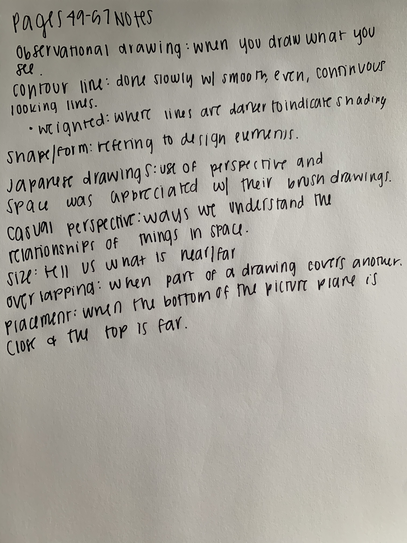
Notes from textbook pages 49-57
White value chart and sphere
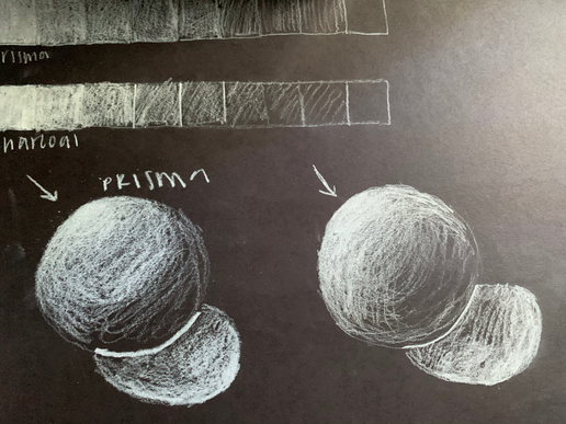
I created two value charts and two spheres. The first value chart I used a white prisma color colored pencil and the second I used a charcoal pencil. For the spheres, I made the white the highlight instead of the shadow.
White ribbon drawing
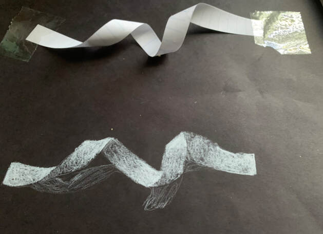
I drew a white ribbon using a prisma color colored pencil. I shaded darker where highlights were and lighter where shadows are. Below the ribbon is the shadow that shows that the ribbon was places onto a surface.
fabric drawings
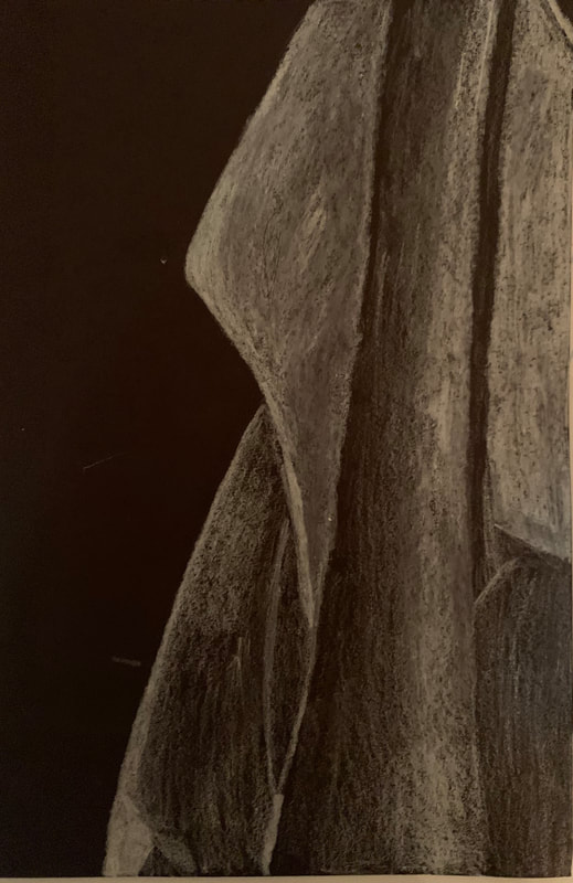
Displayed above are the three fabric drawings I created. The first photo is on black paper, and I used a white charcoal pencil. I did not love the texture of this pencil on the paper but it was easier to create depth within the piece. The second photo is on the brown paper, drawn with white prisma color. This was smoother on the paper but also darker and more heavy. Third was the charcoal pencil, I am not familiar with this type of media, so I definitely feel like I could fix things I’m just not exactly sure how. It was also difficult to complete this since before I had been practicing coloring the highlights and here I had to draw the shadows.
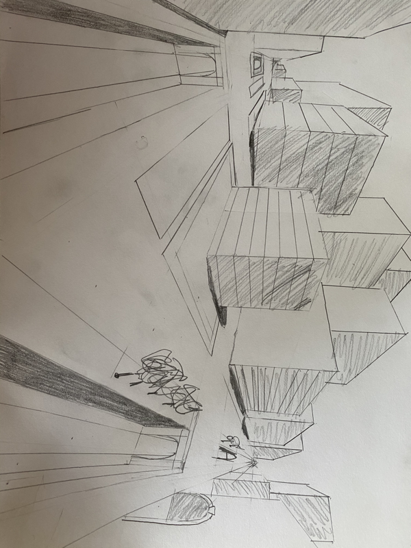
PERSPECTIVE
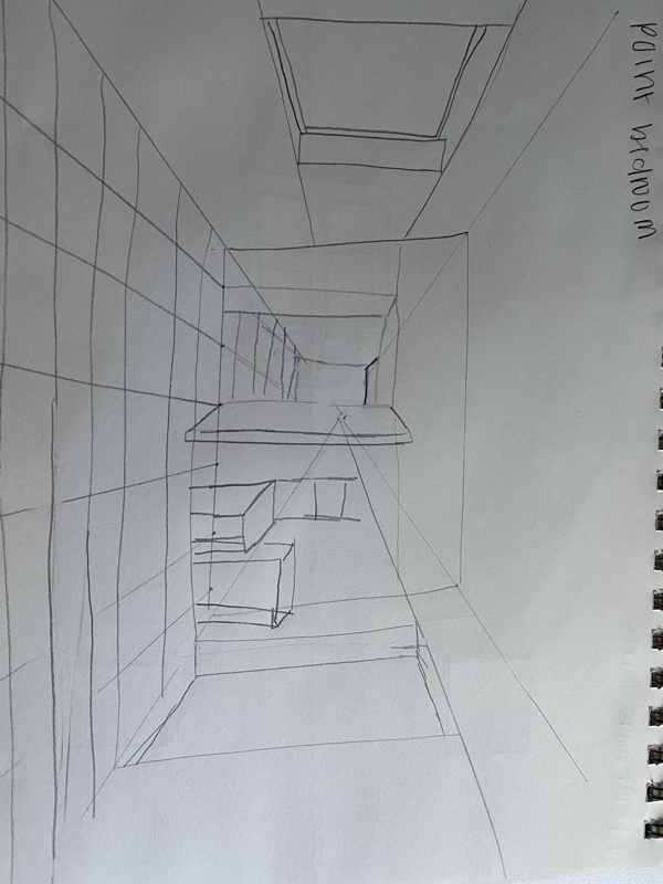
These are my 1 point perspective drawings. I feel that the second video was rushed and hard to follow along because he said not to use a ruler, but it would have looked a lot better if I had used a ruler.
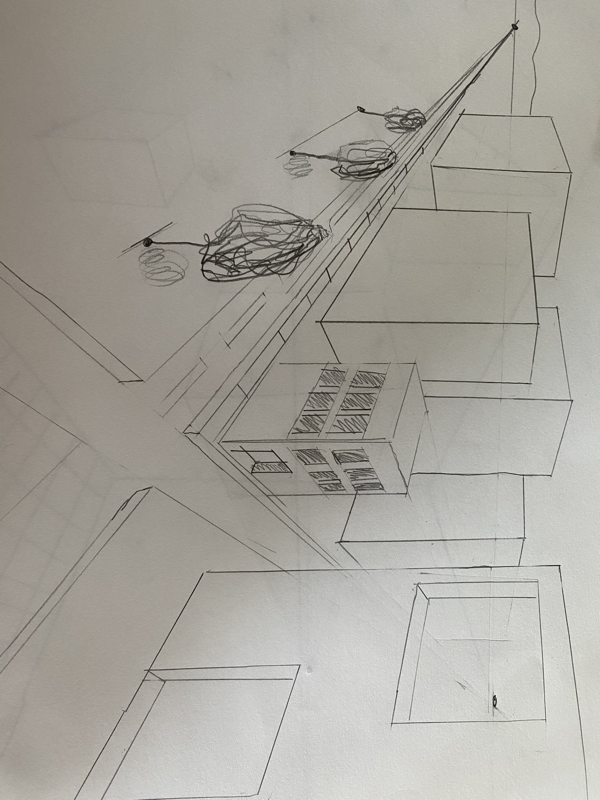
2 point perspective
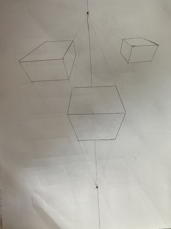
These are my two point perspective drawings. I had a little trouble with getting the lines exactly perfect like the video but I feel that overall I was successful in creating the perspective.
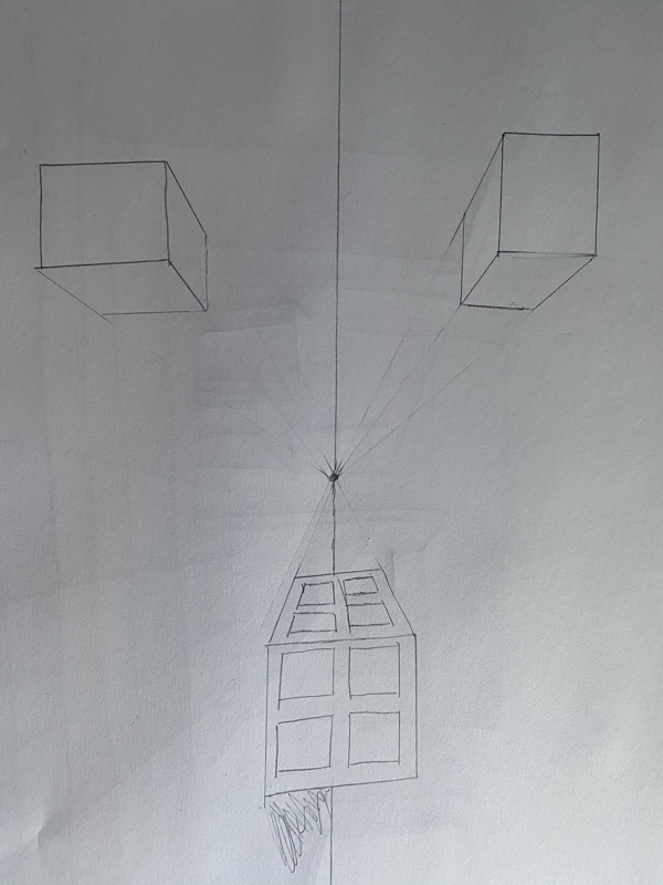
3 point perspectiVe
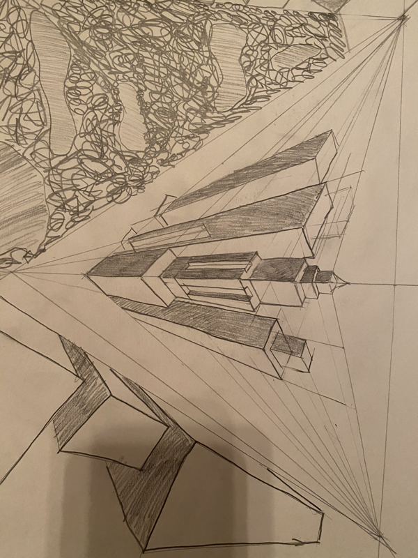
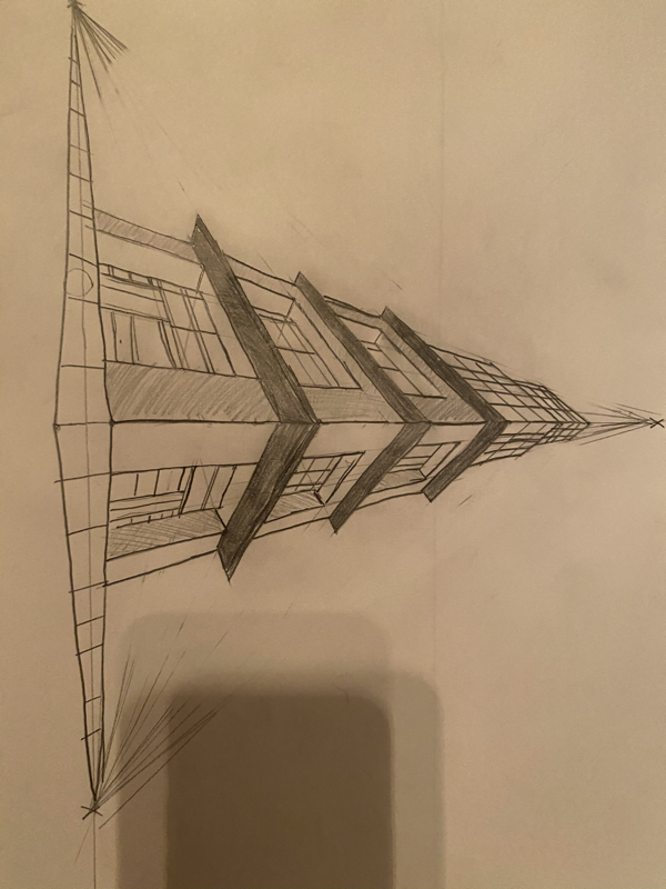
These are my 3 point perspective drawings. I feel like I was most successful with these drawings with my other drawings because I had more practice.
Look at that view BRAINSTORMING ideas
- Surfboard in the water (POV from bottom showing some water).
- Starbucks cup on a table (worms eye view)
- Bouquet of flowers in vase (birds eye view)
- Downtown Apex Street scene (1 point perspective)
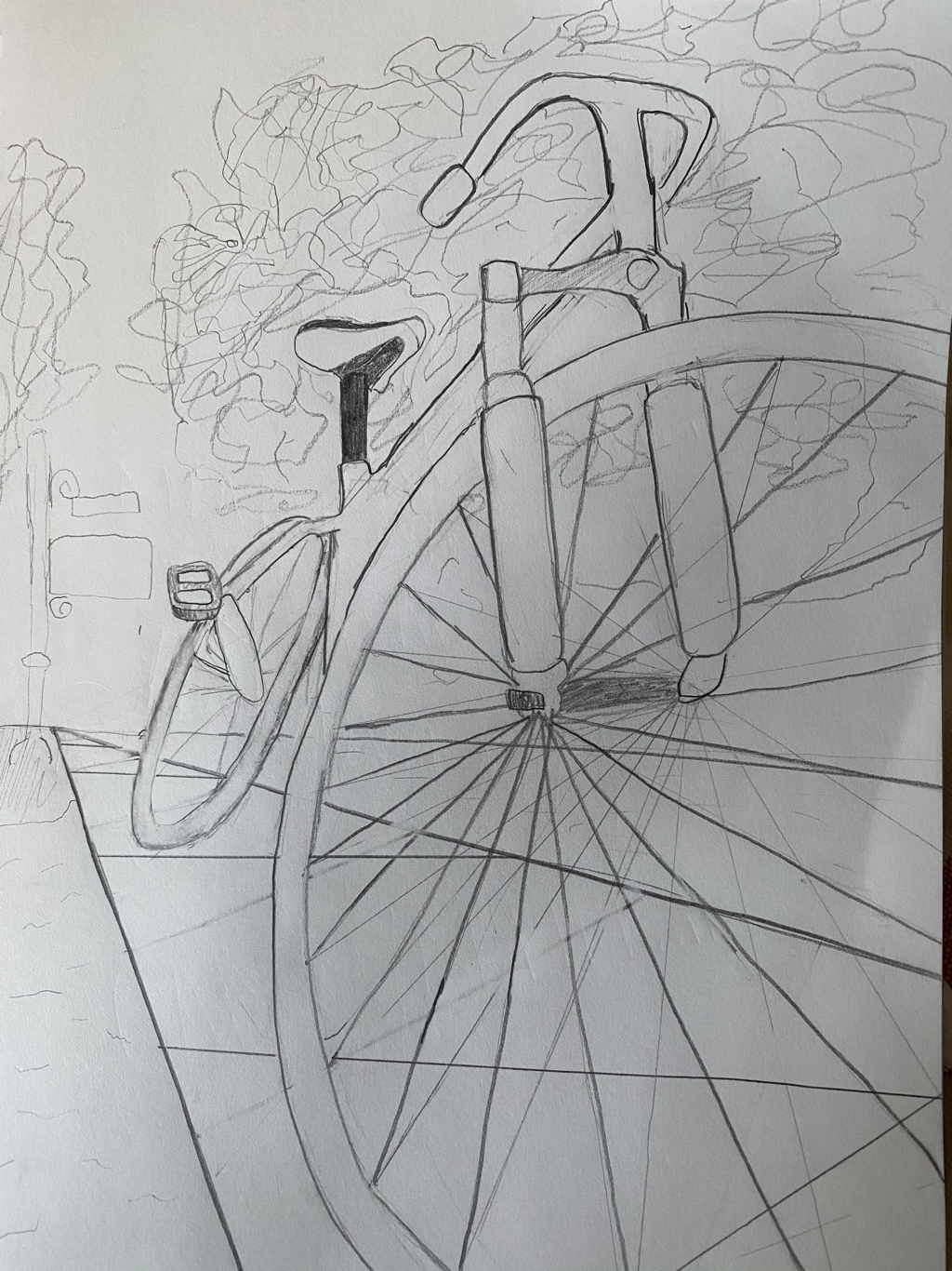
- Bike (worms eye view from the bottom of the front wheel).
- Beach scene (1 point perspective)
- 3 Shopping bags (worms POV)
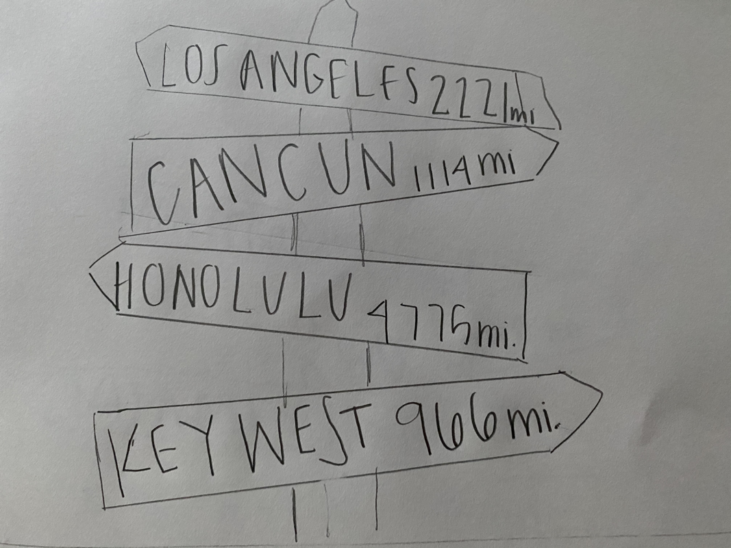
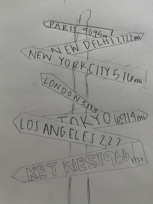
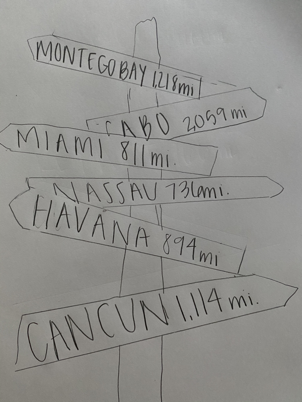
- Street post with places and their distances with arrows (ex. Italy 1500 mi.) 2/1 point perspective
- Person sitting on the ground with foot out (worms eye view) with foot enlarged to show it is close to pov
- Person holding their camera to their eye from birds/worms eye view
- Perspective of my dog from her head?
- POV of tennis ball flying through the air with person swinging in the back
- Worms eye view of a person watering a flower
- One point perspective of jellyfish in ocean
- Birds eye view of my dog jumping for a tennis ball
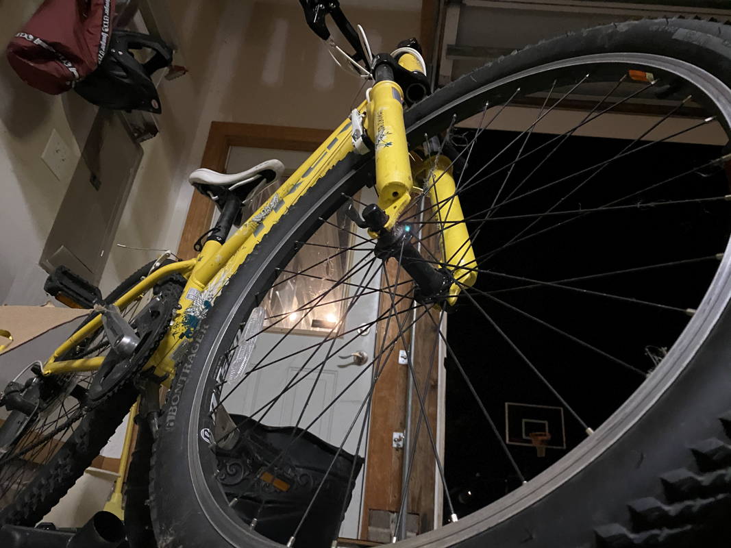
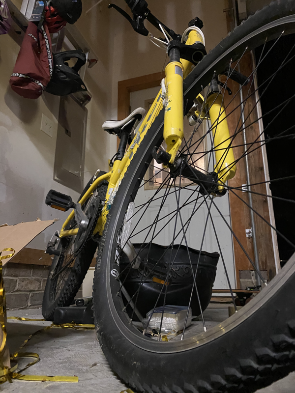
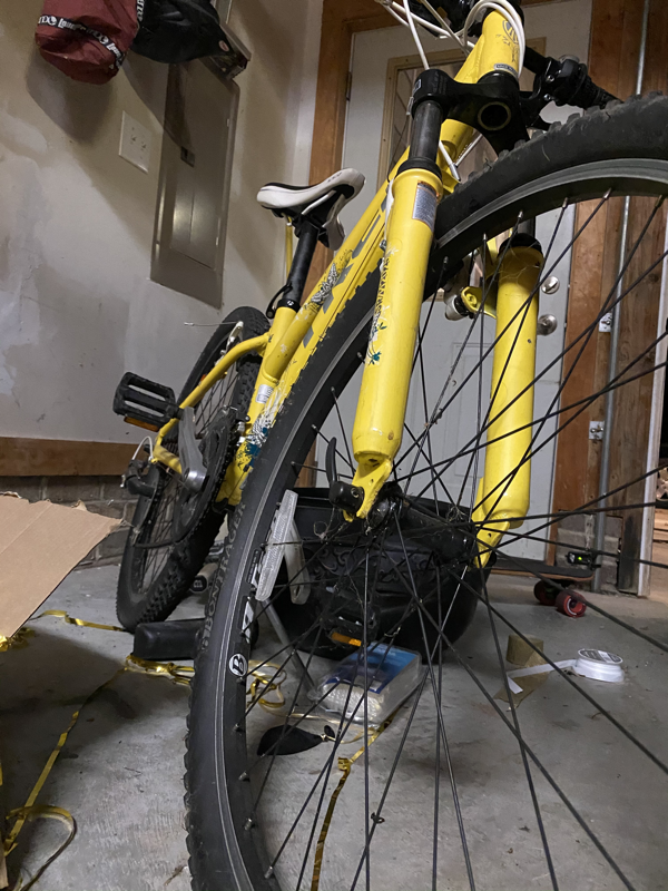
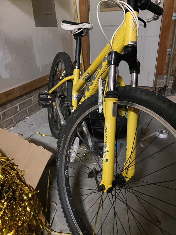
Look at that view reference photos


Look at that view reference drawings


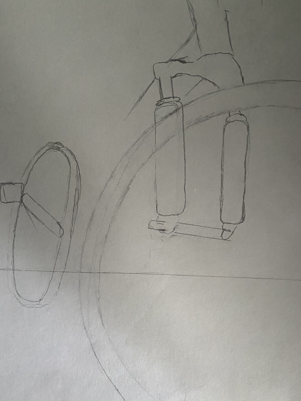
Look at that view final sketch
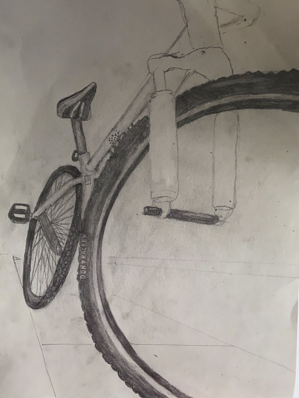
Look at that view in progress photos
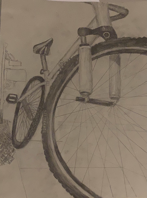
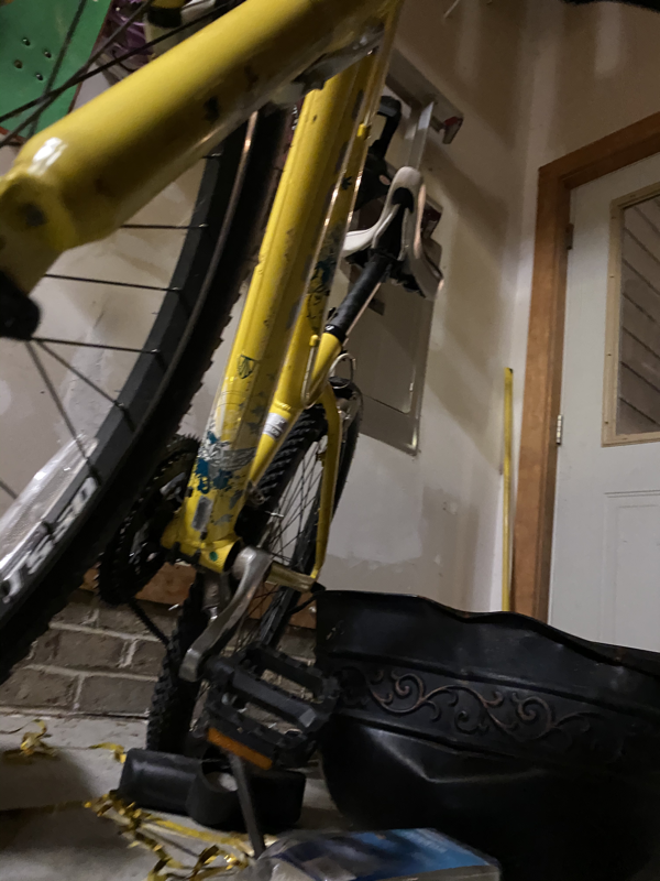
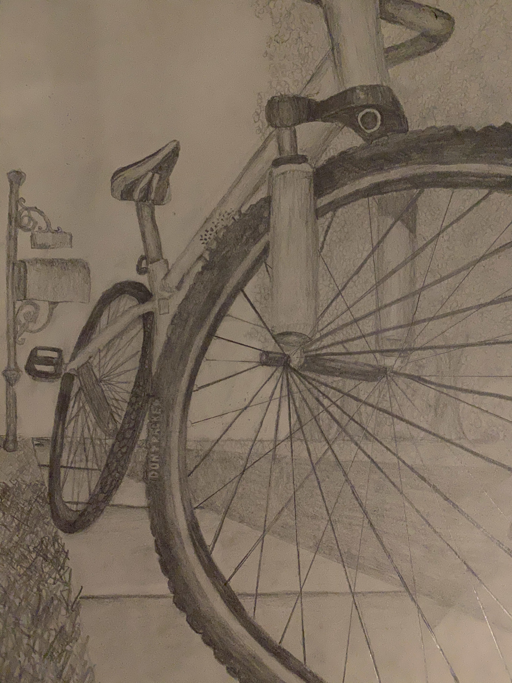
Look at that view fInal drawinG
look at that view questions
1. Describe how you created an interesting point of view? Was it successful? Why or why not?
I created an interesting point of view by going from the bottom side of the bike. This way it shows a different point of view but also an interesting one. It is successful because it shows the whole bike from a different perspective.
2. Why is it important to understand perspective and how to draw it?
Because if a perspective is off then the whole drawing isn't drawn to scale and won't look realistic.
3. How were the pencil and perspective exercises important in the success of your piece?
The exercises were important in the success of my piece because they allowed me to understand points of view and different points of perspective. I used this when drawing the bike, sidewalk, and road.
4. Describe the craftsmanship of your piece. What techniques were used? (How well the project is technically crafted).
I used dark and bold shading of objects in the front of the piece and making those in the back less bold to really show off the bike. I used shading and highlights to create a successful piece. The wheels are dark and so are the wires and black parts of the bike so you can really see them. It is well crafted with the correct perspective and correct coloring.
5. Were you able to achieve depth by showing a foreground, middle ground and back- ground? Explain.
Yes because the bike in the front is very dark and the ground is easily seen but not as focused to detail and then the background you can see but not all the minor details are there which makes it more in the back than in the front.
6. Explain your experience with using perspective and the project in general. What were the obstacles and advantages?
I sometimes had trouble at the beginning of the practice drawings because I didn't understand the perspective but after a lot of practice I got it down good.
7. Looking back on the progression of this project, what skills, techniques or other information would you like to have been taught? Do you feel you were prepared for this project?
I felt that I was fully prepared for this project, maybe drawing other objects besides square buildings in the different perspectives would have been helpful because most people did not end up drawing buildings but all we practiced was buildings.
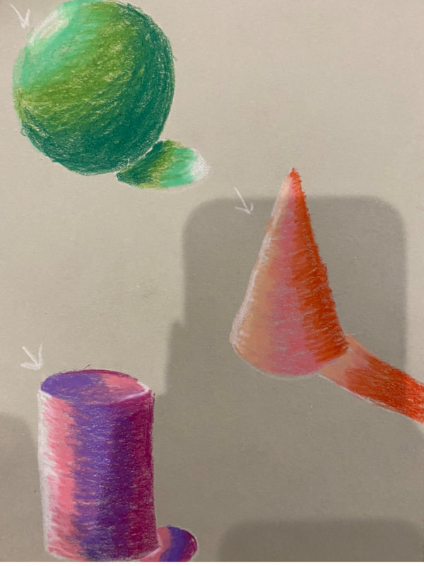
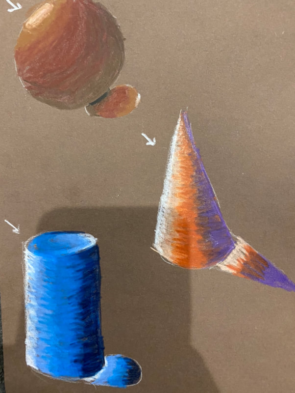
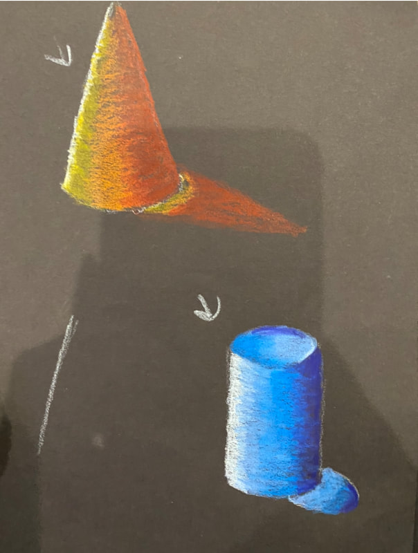
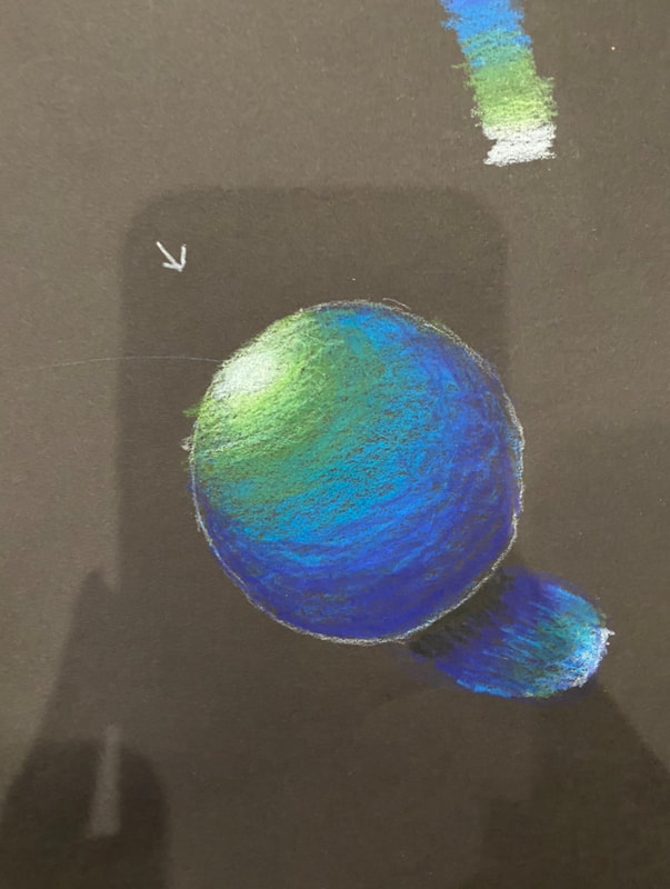
Colored pencil and pastel
Colored pencil forms:
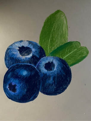
Colored pencil fruit:
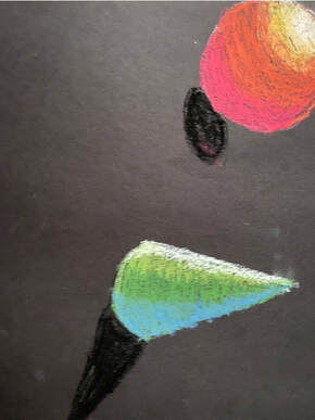
Pastel forms:
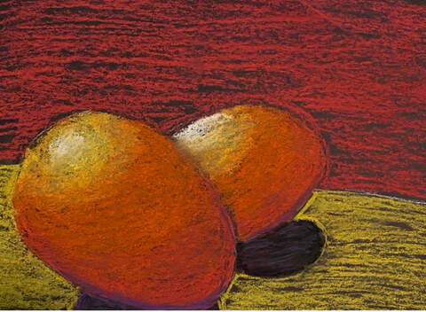
Pastel egg:
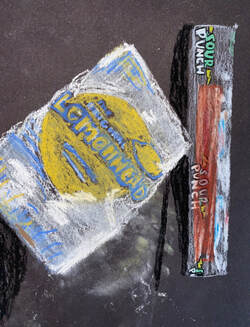
Pastel candy:
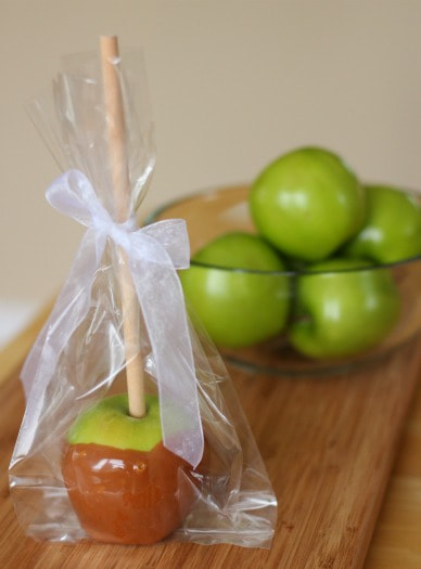
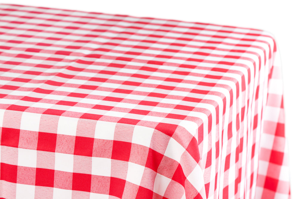
"Look what i can see through" Project
Brainstorming ideas:
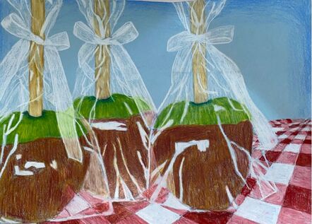
- Candy apple wrapped in clear wrapping sitting on a red and white tablecloth*
- Person looking out their car window
- Goldfish in it’s bowl*
- Person holding clear umbrella in the rain *
- Clear jar with dog treats
- Sunset reflection on a car window
- Tostitos chips bag with clear opening sitting on a table
- Dog looking out the window from outside the window perspective
- Perfume bottle and makeup brushes sitting on a table
- Ziplock bag with chocolate chip cookies
- Boat window looking out to the ocean
- Construction paper package wrapped in clear wrapping
- Cotton candy in plastic wrapping at the fair*
- Christmas tree through a house window *
- Christmas cookies wrapped in Saran Wrap.
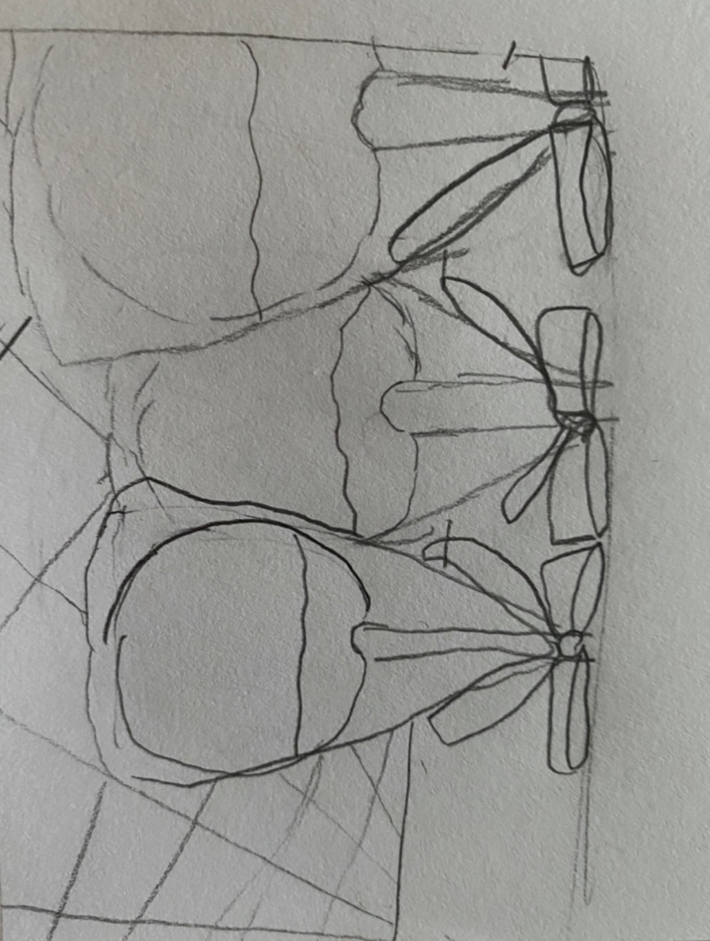
Reference Photos:

Compositional Sketches:
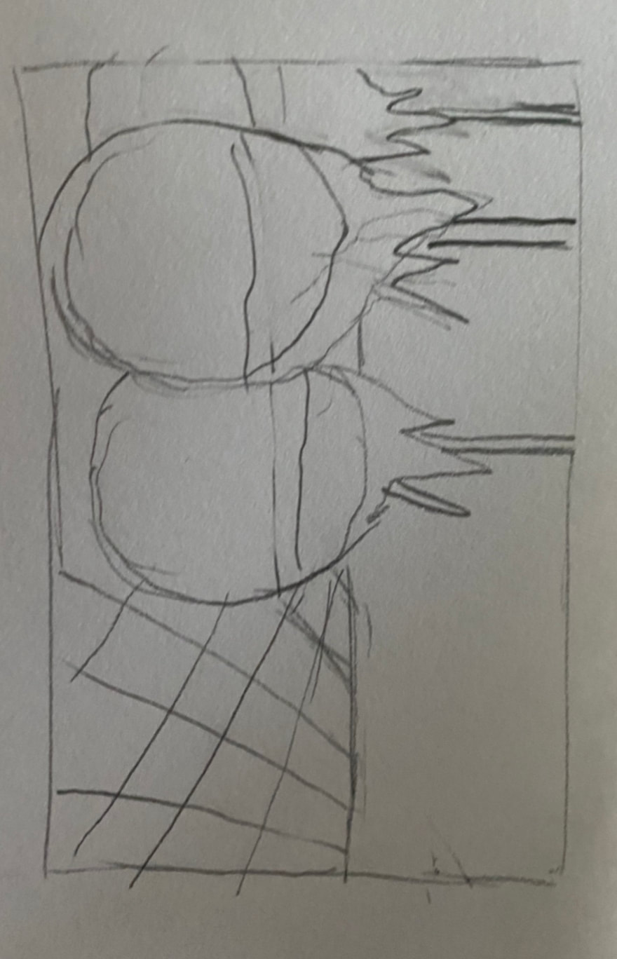
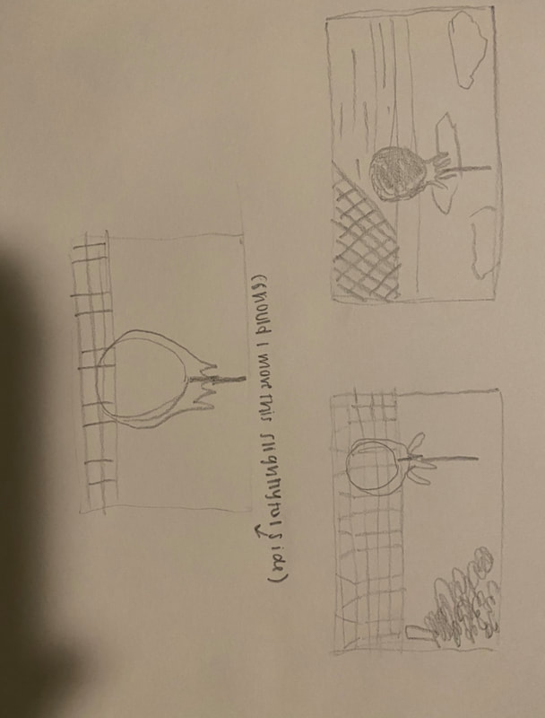
Final Sketch:
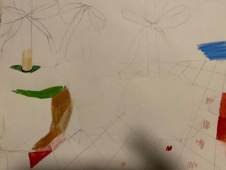
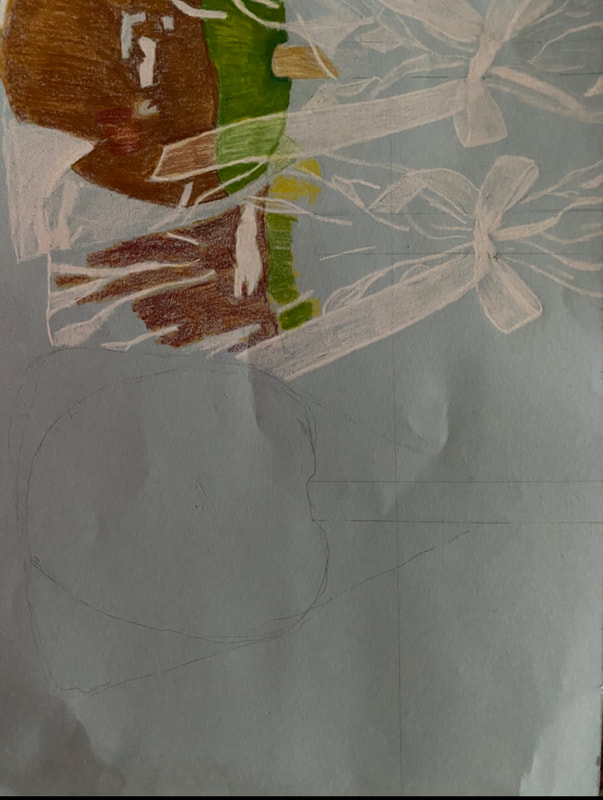
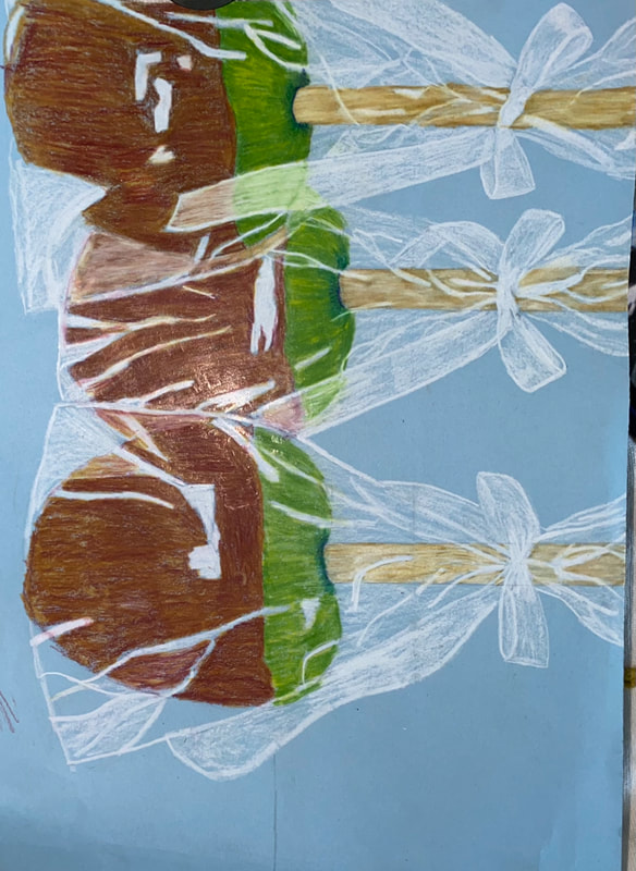
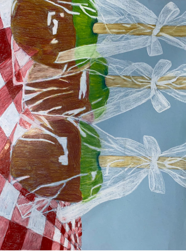
In progress:
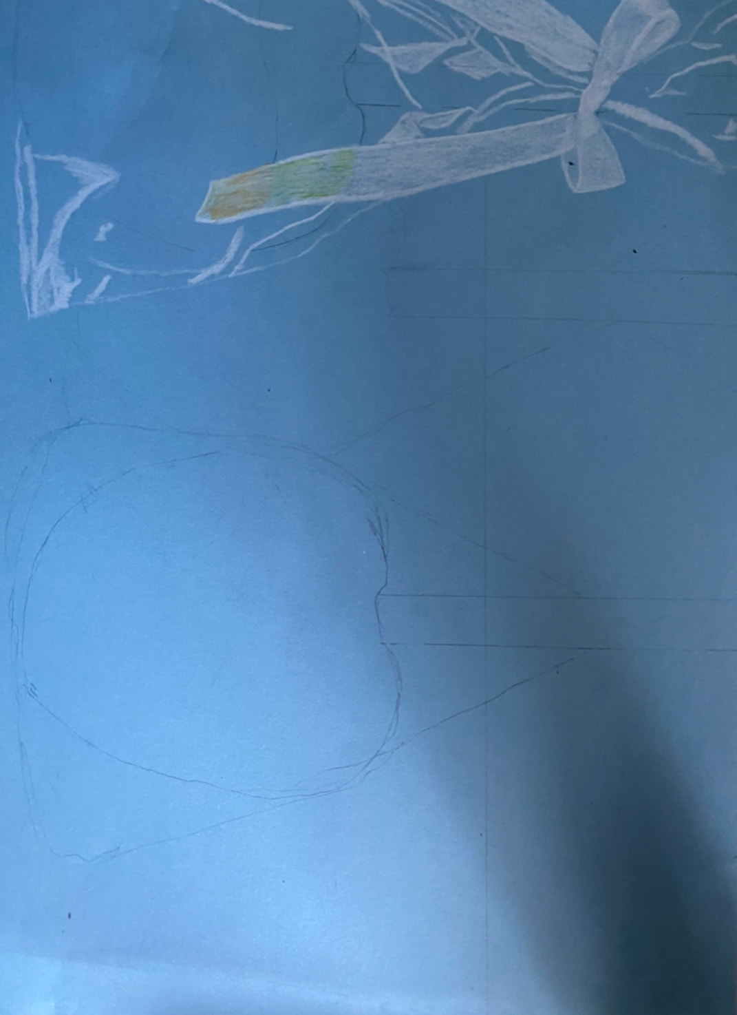
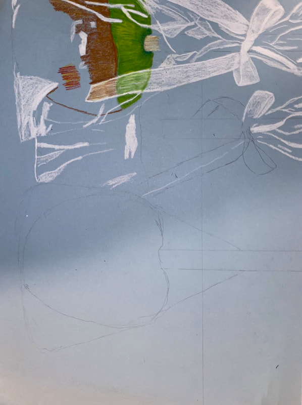
Final Drawing:
Self Evaluation:
- Describe the craftsmanship of your drawing. (Is it neat and well executed?)
I think I did well with the craftsmanship of this drawing. Overall I think the colors and their placement are neat but also I could have been neater with the tablecloth and the coloring of the caramel.
- Describe how you created the look of transparency.
I created the look of transparency by using bright white highlights where the clear wrapper would be seen and then colored in white slightly at the top so you can see that it is a clear wrapping.
- Describe your choice of colors/color harmonies and how you used them throughout the artwork.
I think the colors look good together, especially with the two complementary colors red and green with a pop of brown really makes it pleasing to look at.
- How did you create contrast in your drawing?
I created contrast in my drawing by using bright colors that stand out and darker colors where shadowing was. The red and green also added to the contrast.
- How did you use textures, highlights and shadows to enhance your artwork?
I used the texturing of the wrapping to make the piece look more realistic, and a smooth texture for the apple. The highlights bring out the apples and the shadows at the top and bottom of the apple bring it all together. - Discuss the importance of understanding the media (prisma or pastels) and acquiring the skills necessary to create a successful project. How beneficial were the mini assignments?
When I was using prisma colored pencils it was important for me to start out light and then darken as I go. It is also important to mix colors and use colors that pop so that the piece is more interesting. for example the blue and yellow in the green part of the apple. - Describe any difficulties you had creating your drawing and what you could do to improve your drawing?
The only difficulty I had was how time consuming it was to create the look that I wanted for the piece.
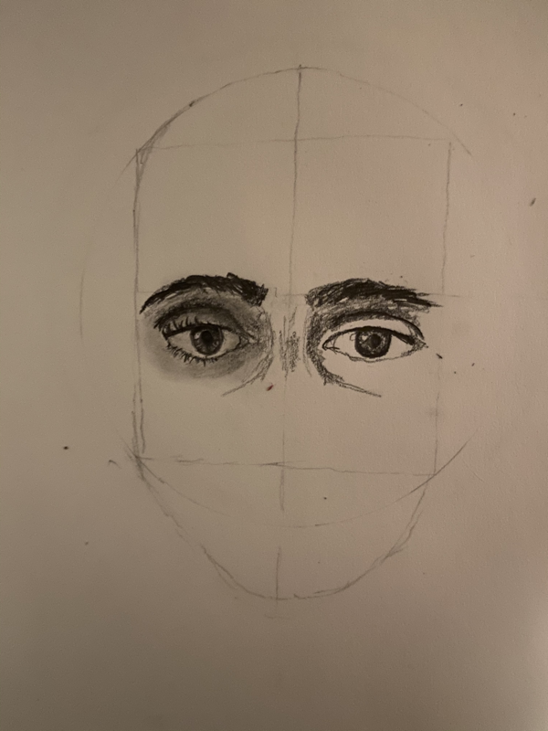
Portrait drawing uNit
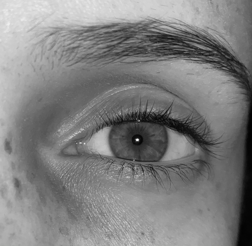
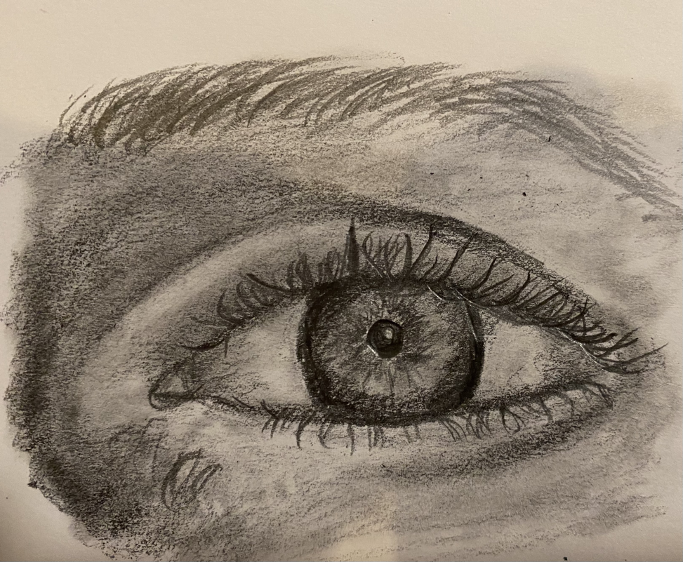
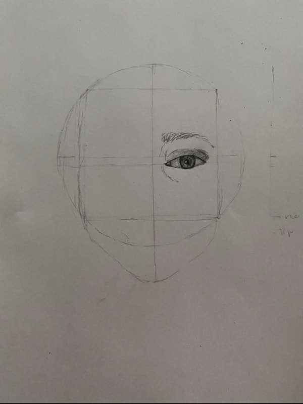
Above is my eye reference photo and drawing.
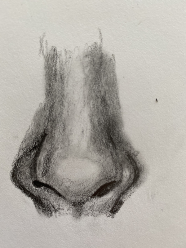
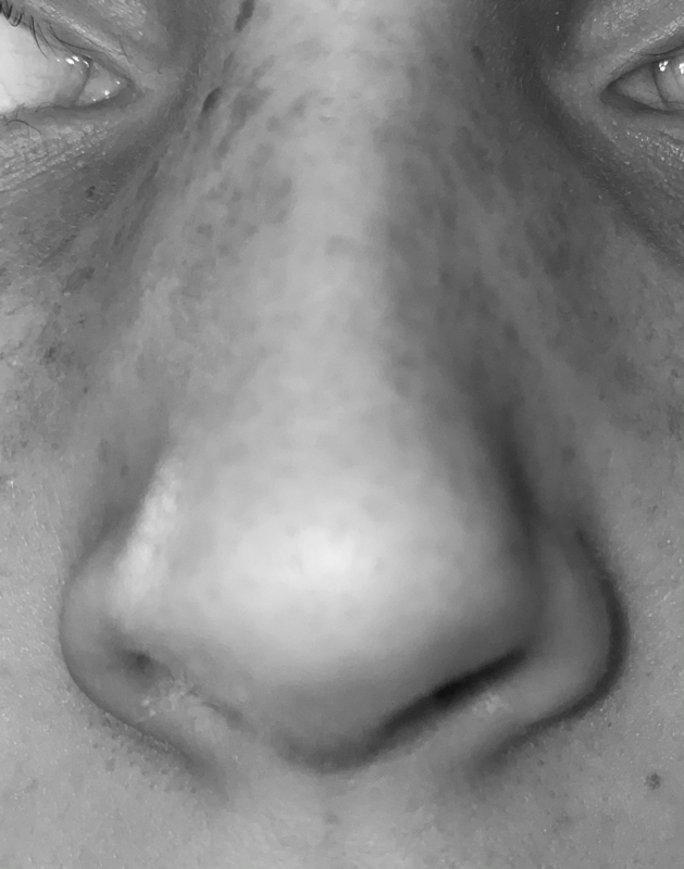
Above is my nose reference photo and drawing.
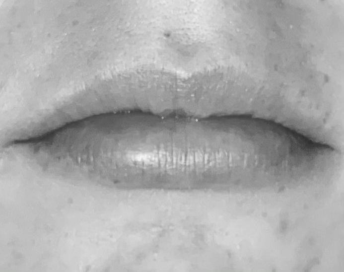
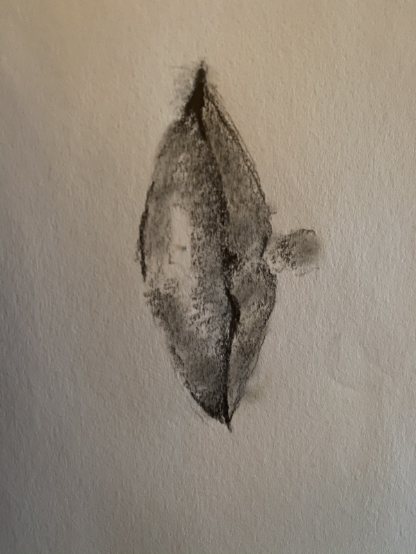
Above is my lips reference photo and drawing.
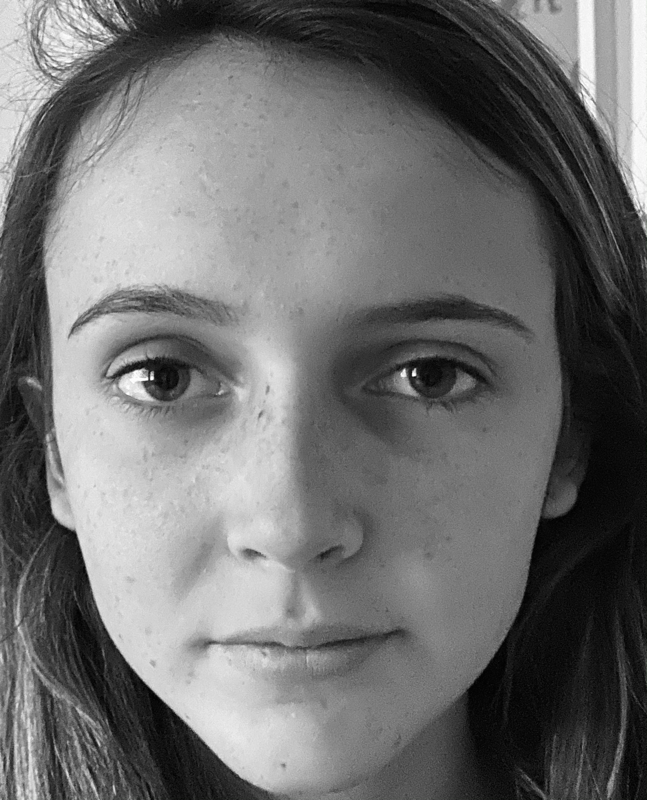
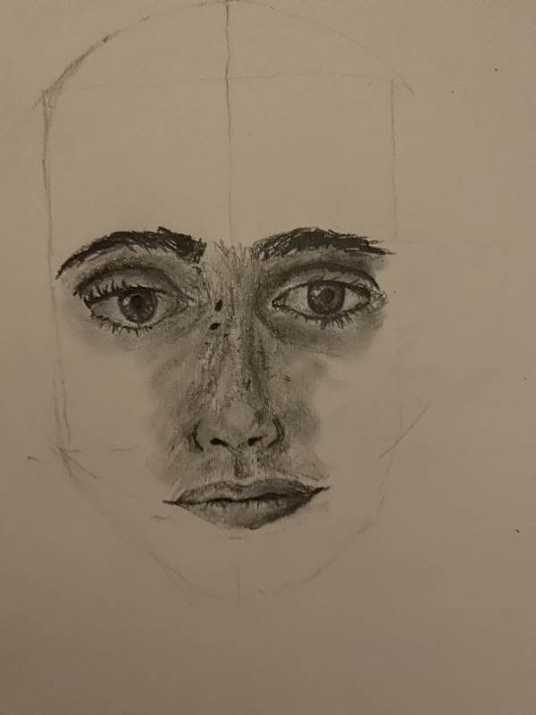
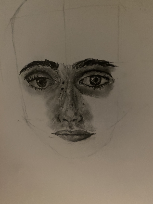
Above is my reference photo and in progress for the face drawing assignment.
"Self portrait" unit
List of brainstorming ideas:
- My face split in half, one side happy with sunshine and flowers in background, and one side sad with dark clouds and rain (colored pencil drawing)
- My face on a photograph, ripped up, and left on the street.
- My face looking through a mirror but you can only see the mirror and the hand holding it
- My face but with different colored features (blonde hair, blue eyes, nose piercing)
- My face with stitchings all over it like frankenstein
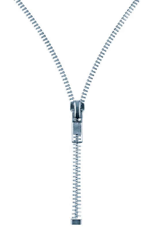
- My face being split down the center with a zipper
- My face melted on the ground like a popsicle with a popsicle stick
- My face in a photo frame hanging on the wall
- My face but underwater
- My reflection in a puddle on the street
- My face but frosted (white and blue, snowy, iced hair)
- One side of my face right side up but the other side is upside down
- My hand pulling the side of my face but my skin stretches abnormally far.
- My face as a cartoon in a princess dress like one of the Disney princesses
- My face distorted in some way

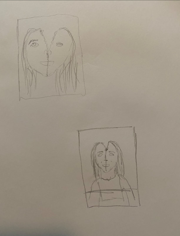
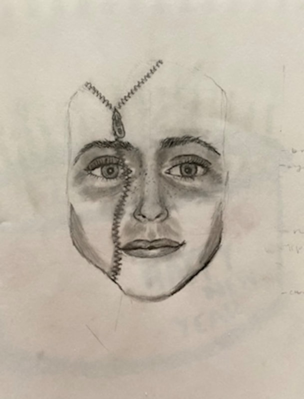
Above are all my sketches, my photos used, compositional, revised and final sketch.
These are my in progress photos.
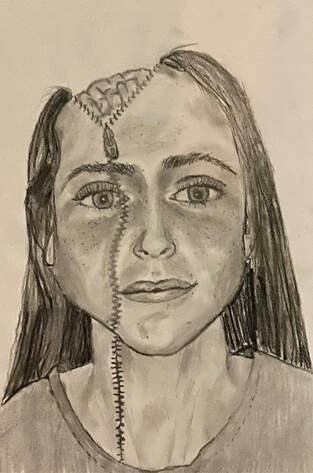
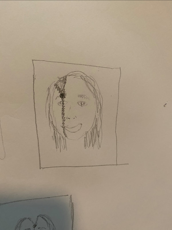
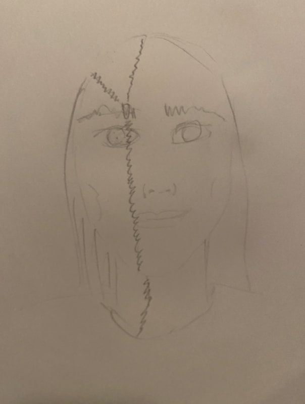
Above is my final drawing.
Self evaluation:
1. Explain the process you went through to develop your drawing.
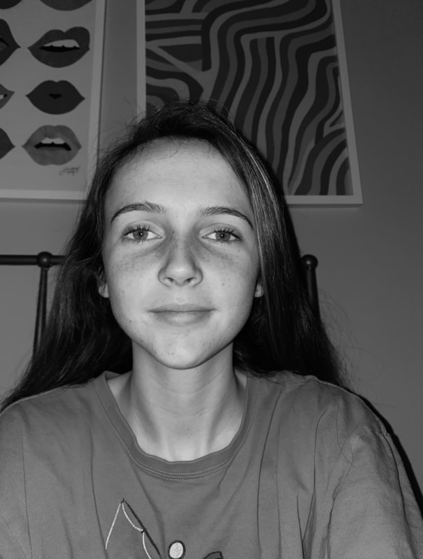
-I brainstormed ideas and ended up choosing to create my face, being split by a zipper. As I was completing my final drawing, I decided to add a brain in the empty space. I used pencil, because I feel that I work best with this medium.
2. Discuss your choice of how you represented yourself (mechanical, expressive, stitched together, etc)?
- I represented myself stitched together, and also being split apart with a zipper. I think it is interesting watching the stitching go down the face and opening to the brain.
3. Did you achieve a full range of value within your portrait? How?
- I feel that I achieved a full range of value in my portrait, I used my HB and charcoal pencil as well as my graphite pencil. I tried to exaggerate dark and light parts of the piece so that they contrast and achieve a more realistic looking piece.
4. Describe your craftsmanship. Is the artwork executed and crafted neatly?
I like how I crafted the piece. First, I drew the eyes, and nose on the side with no zipper, next I added the zipper and the features on the zippers side. I then drew the mouth and shaded the face as I saw it in the photo. I then drew the neck and shirt and shaded those accordingly. I finally drew the hair and the brain. I felt that it was crafted neatly.
5. How were you able to capture your look?
I was able to capture my look by drawing what I see.
6. Explain how you made sure you had correct facial feature placement.
To have correct facial feature placement I followed and copied exactly what I saw in my reference photos. I also referred to the videos on google classroom.
7. Explain the importance of learning how to draw all the features individually.
Learning how to draw the individual features is important because each of them have specific details and value that need to be focused on to create the larger face.
8. What part of this unit was the most beneficial and why?
I felt that the video drawing the whole face was the most beneficial because it not only taught me how to put all the facial features together but how to draw them individually.
9. List any obstacles you had to overcome and how you dealt with them.
The main obstacle I had throughout this project was getting the correct shading. I knew I had to exaggerate some things but I had to be sure to shade in the right place. I dealt with this by just making sure I drew what I saw.
