|
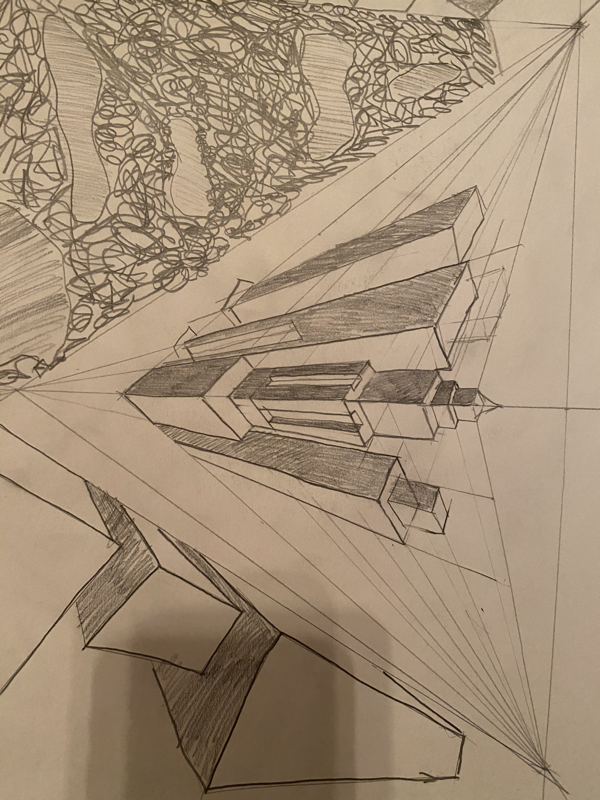
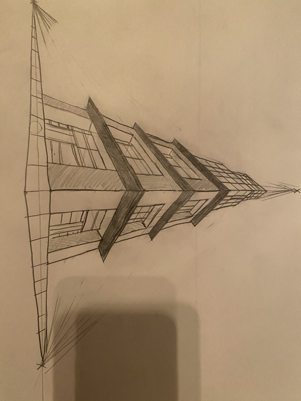
pictured above are my reference photos, including my own photos, then my sketch drawings, then my 20 ideas.  This is my color sketch.  FINAL----- 1. Describe the craftsmanship of your prints. My project was crafted by first cutting out the blue background, then the orange then the red and then the green and then the purple. I had to be very careful with removing the pieces. I directly followed my sketch except I decided to make the top squares completely purple. The paint was overall easy to work with except the orange would not grab onto the roller and the purple was more liquid considering it was a different brand. 2. How did you use texture, color harmony and balance to define your choice of subject. For texture I made the insides of the window purple so that it would look three-dimensional. I chose the colors I did to really show the depth of the colosseum and whats around it. My colors balance generally well but the purple showed up a lot darker than I had hoped. 3. If you could recreate your pieces what would you have done differently to enhance your final outcome? If I were to recreate my pieces i would have maybe used a different shade of blue for the background and maybe instead of the windows being blue I would have made them another color all together because in my sketch it did not look empty but in my final I thought that space could have been used better. I also would have lightened up my purple because I did not know how dark it would be on top of the green. These are my in progress photos.
0 Comments
Leave a Reply. |
AuthorWrite something about yourself. No need to be fancy, just an overview. Archives
May 2019
Categories |
 RSS Feed
