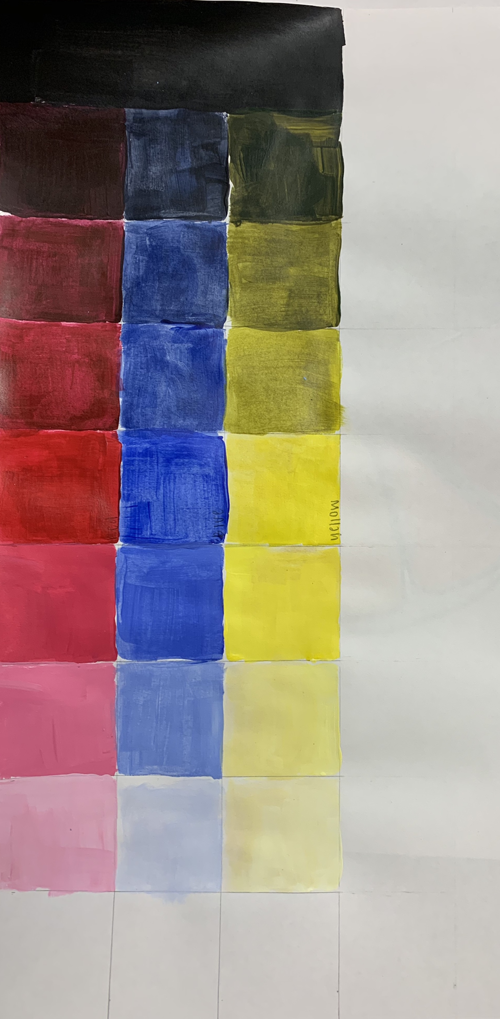
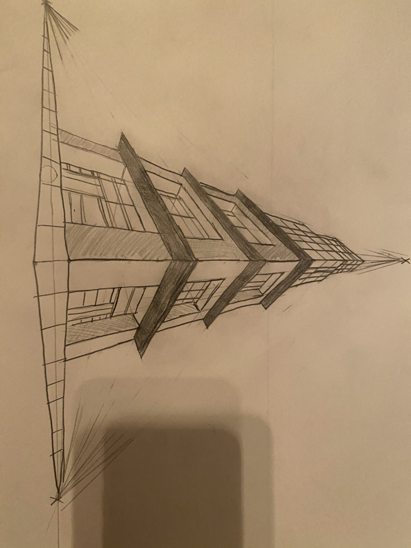
 This is my 3 value charts with yellow, red, and blue. 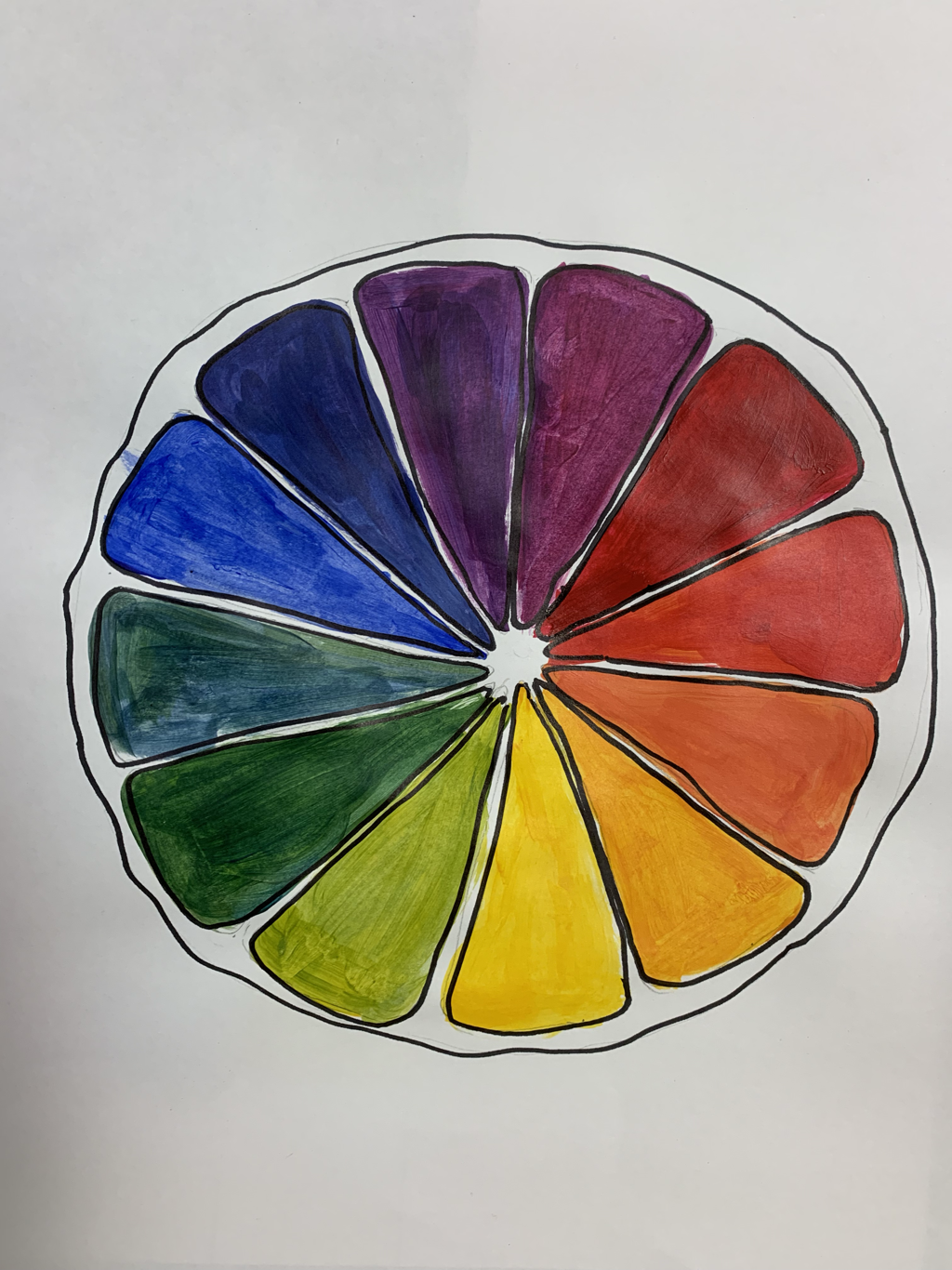 This is my creative color wheel. I created a lemon/lime inside to put my colors onto. extra credit paperRene Magritte
Rene Magritte’s pieces were part of the Surrealism movement. The surrealism art movement began in 1924 and ended in 1966. The movement began with art by Dali. Surrealism was considered a literary and artistic moment. It was based on an Enlightenment idea that idealized reason and individualism. Its main purpose was to show one's thoughts and experiences. It was also based on thoughts from the unconscious mind also known as dreams which was the main source of artistic creativity. Some famous paintings from the surrealism include The Persistence of Memory, Guernica, The Lovers, and Philosophers Lamp. (These are some of the paintings) Rene Magritte was born in Belgium in 1898. He grew up with his brother and his grandmother after his parents committed suicide. His ideas stemmed from the fact that he found tragedy in films that were portrayed in his paintings. He was in the Belgian army and then moved onto other work. His art career began when he started working at a commercial advertising company where he began working and experimenting painting. He then moved to study art at Académie Royale des Beaux-Arts. He originally was inspired by the juxtaposition of different things in pieces. For the next two years he continued practicing the juxtaposition of elements in his art until he became a professional artist. His surrealist movements were influenced by Chirico's paintings. His art was influenced by dreams and exaggerated objects that were out of the ordinary. He painted his hallucinations and thoughts. One of Rene Magritte’s paintings is The Son of Man. The Son of Man is a surrealist painting that displays a man and a green apple covering his face. Magritte made this as a self portrait. Another one of Rene Magritte’s paintings is The Lovers. It is a painting of two people kissing with sheets over their faces. The painting portrays the two people being blinded by the cloth while they’re kissing. Bibliography. Mann, Jon. “What Is Surrealism?” Google, Google, 23 Sept. 2016, www.google.com/amp/s/www.artsy.net/article/artsy-editorial-what-is-surrealism/amp. Mann, Jon. “What Is Surrealism?” Google, Google, 23 Sept. 2016, www.google.com/amp/s/www.artsy.net/article/artsy-editorial-what-is-surrealism/amp. “Rene Magritte and His Paintings.” Henri Matisse, www.renemagritte.org/. Mann, Jon. “What Is Surrealism?” Google, Google, 23 Sept. 2016, www.google.com/amp/s/www.artsy.net/article/artsy-editorial-what-is-surrealism/amp. “Rene Magritte and His Paintings.” Henri Matisse, www.renemagritte.org/. “The Lovers II, 1928 by Rene Magritte.” Henri Matisse, www.renemagritte.org/the-lovers-2.jsp. Jain, Avani, and Avani Jain. “How to Look at the Painting : ‘The Son of Man’ by René Magritte.” Medium, Medium, 10 Mar. 2018, medium.com/@avanijain_81449/how-to-look-at-the-painting-the-son-of-man-by-rené-magritte-dd7a2f91f39f. Mann, Jon. “What Is Surrealism?” Google, Google, 23 Sept. 2016, www.google.com/amp/s/www.artsy.net/article/artsy-editorial-what-is-surrealism/amp. “Rene Magritte and His Paintings.” Henri Matisse, www.renemagritte.org/. “The Lovers II, 1928 by Rene Magritte.” Henri Matisse, www.renemagritte.org/the-lovers-2.jsp. MY IMAGES WOULD NOT LOAD ONTO WEEBLY but I listed their titles in the writing.
0 Comments
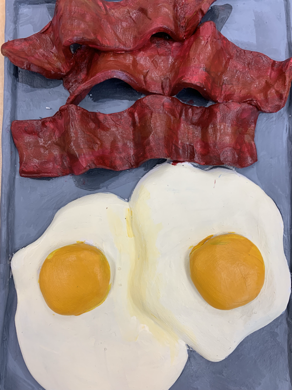
 These are my 20 clay food ideas These are my reference images and my color sketch of the clay food. These are my in progress photos. 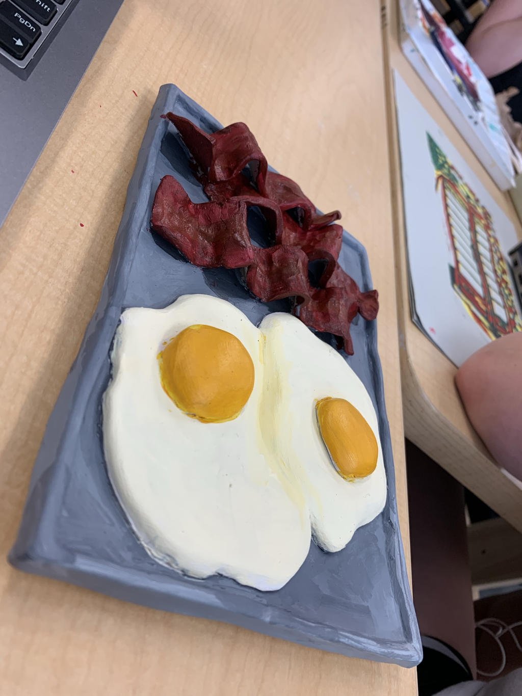 This is my clay food final piece. CRITIQUE QUESTIONS FOR CLAY FOOD
1. Describe the craftsmanship of your sculpture. When I made this sculpture I created each bacon strip by making a slab, cutting it into strips, and making it have texture of bacon. I did the same with the eggs, and for the yolk I made a ball of clay and flattened it to look like yolk. I made a rectangular plate because the food took up space better that way. I shaped the bacon like bacon and placed it next to the eggs. 2. What was the most difficult part of this project? The most difficult part of this project was keeping everything together while making each line smooth and perfect. 3. Did your color choices work harmoniously? I think that my color choices worked very well together.I feel like picking grey for the plate brings more attention to the eggs and the bacon. The shadowing makes it look more realistic and finished. 4. Is your sculpture interesting from all views? I think my sculpture is interesting from all views. The texture and shape of the bacon makes it look very realistic and cooked just right. The eggs are portioned correctly to the bacon and the plate. I think it is very pleasing to look at. 5. Describe the differences between constructing a sculpture and creating something in 2D. When you create a sculpture you make the piece view-able from many different view-points while creating something in 2D is only from one perspective. pictured above are my reference photos, including my own photos, then my sketch drawings, then my 20 ideas. 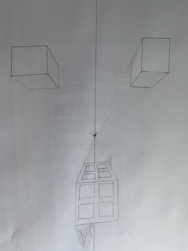 This is my color sketch.  FINAL----- 1. Describe the craftsmanship of your prints. My project was crafted by first cutting out the blue background, then the orange then the red and then the green and then the purple. I had to be very careful with removing the pieces. I directly followed my sketch except I decided to make the top squares completely purple. The paint was overall easy to work with except the orange would not grab onto the roller and the purple was more liquid considering it was a different brand. 2. How did you use texture, color harmony and balance to define your choice of subject. For texture I made the insides of the window purple so that it would look three-dimensional. I chose the colors I did to really show the depth of the colosseum and whats around it. My colors balance generally well but the purple showed up a lot darker than I had hoped. 3. If you could recreate your pieces what would you have done differently to enhance your final outcome? If I were to recreate my pieces i would have maybe used a different shade of blue for the background and maybe instead of the windows being blue I would have made them another color all together because in my sketch it did not look empty but in my final I thought that space could have been used better. I also would have lightened up my purple because I did not know how dark it would be on top of the green. These are my in progress photos.
|
AuthorWrite something about yourself. No need to be fancy, just an overview. Archives
May 2019
Categories |
 RSS Feed
